Gold Price Prediction Using Machine Learning in Python
 By Anish Banerjee
In this tutorial, we will be predicting Gold Price by training on a Kaggle Dataset using machine learning in Python. This dataset from Kaggle contains all the depending factors that drive the price of gold. To achieve this, we will have to import various modules in Python. We will be using Google Colab To Code.
Modules can be directly installed through the “$ pip install” command in Colab in case they are not already present there.
We will be importing Pandas to import dataset, Matplotlib and Seaborn for visualizing the Data, sklearn for algorithms, train_test_split for splitting the dataset in testing and training set, classification report and accuracy_score for calculating accuracy of the model.
Various errors will be analyzed to check the overall accuracy. Plotting the graph will help us see how deviated the actual and predicted results are.
The Algorithm we will be using is Random Forest as it is a combination of several Decision Trees, so it has higher overall accuracy on all the models.
Let’s start by importing the necessary libraries
import numpy as np

# data processing

import pandas as pd
import numpy as np

# data visualization

import seaborn as sns
%matplotlib inline
from matplotlib import pyplot as plt
from matplotlib import style
Analyzing, cleaning and understanding the dataset of gold price
Reading the CSV file of the dataset and storing in “df”
df=pd.read_csv("/content/gld_price_data.csv")
df.head()
| Date | SPX | GLD | USO | SLV | EUR/USD | |
|---|---|---|---|---|---|---|
| 0 | 1/2/2008 | 1447.160034 | 84.860001 | 78.470001 | 15.180 | 1.471692 |
| 1 | 1/3/2008 | 1447.160034 | 85.570000 | 78.370003 | 15.285 | 1.474491 |
| 2 | 1/4/2008 | 1411.630005 | 85.129997 | 77.309998 | 15.167 | 1.475492 |
| 3 | 1/7/2008 | 1416.180054 | 84.769997 | 75.500000 | 15.053 | 1.468299 |
| 4 | 1/8/2008 | 1390.189941 | 86.779999 | 76.059998 | 15.590 | 1.557099 |
It is really important to understand and know the dataset we are working with to yield better results.
Printing the information about the dataset
df.info()
<class 'pandas.core.frame.DataFrame'>
RangeIndex: 2290 entries, 0 to 2289
Data columns (total 6 columns):
Date       2290 non-null object
SPX        2290 non-null float64
GLD        2290 non-null float64
USO        2290 non-null float64
SLV        2290 non-null float64
EUR/USD    2290 non-null float64
dtypes: float64(5), object(1)
memory usage: 107.5+ KB
| SPX | GLD | USO | SLV | EUR/USD | |
|---|---|---|---|---|---|
| count | 2290.000000 | 2290.000000 | 2290.000000 | 2290.000000 | 2290.000000 |
| mean | 1654.315776 | 122.732875 | 31.842221 | 20.084997 | 1.283653 |
| std | 519.111540 | 23.283346 | 19.523517 | 7.092566 | 0.131547 |
| min | 676.530029 | 70.000000 | 7.960000 | 8.850000 | 1.039047 |
| 25% | 1239.874969 | 109.725000 | 14.380000 | 15.570000 | 1.171313 |
| 50% | 1551.434998 | 120.580002 | 33.869999 | 17.268500 | 1.303296 |
| 75% | 2073.010070 | 132.840004 | 37.827501 | 22.882499 | 1.369971 |
| max | 2872.870117 | 184.589996 | 117.480003 | 47.259998 | 1.598798 |
Data Visualisation: Gold price prediction in Python
It is really important to visualize the data pictorially to get a flow of it, internal relationships, and to see hidden patterns from graphical representation.
Plotting heatmap to analyze the dependency and relationship between features
import matplotlib.pyplot as plt
import seaborn as sns

corr = df.corr()
plt.figure(figsize = (6,5))
sns.heatmap(corr,xticklabels=corr.columns.values,yticklabels=corr.columns.values,annot=True,fmt='.3f',linewidths=0.2)
plt.title('Feature Corelation using Heatmap ', y = 1.12, size=13, loc="center")

Printing the factors on which “GLD” factor depends on most in descending order
print (corr['GLD'].sort_values(ascending=False), '\n')
GLD        1.000000
SLV        0.866632
SPX        0.049345
EUR/USD   -0.024375
USO       -0.186360
Name: GLD, dtype: float64
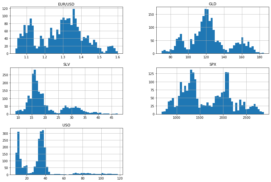
Printing histograms to see layout of values for each feature
import matplotlib.pyplot as plt
df.hist(bins=50, figsize=(15, 10))
plt.show()
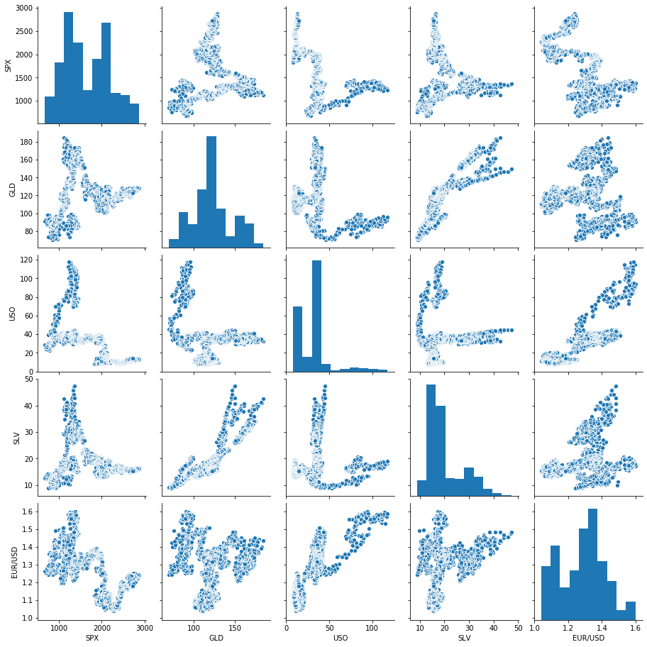
Plotting sns pair plot to see pairwise relation between all the features
sns.pairplot(df.loc[:,df.dtypes == 'float64'])
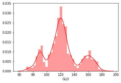
sns.distplot(df['GLD'], color = 'red')
print('Skewness: %f', df['GLD'].skew())
print("Kurtosis: %f" % df['GLD'].kurt())
sns.jointplot(x =df['SLV'], y = df['GLD'])

Preparing a new feature with intensifying the most important feature driving the output
df["new1"]=df["SLV"]*5
df.head()
| Date | SPX | GLD | USO | SLV | EUR/USD | new1 | |
|---|---|---|---|---|---|---|---|
| 0 | 1/2/2008 | 1447.160034 | 84.860001 | 78.470001 | 15.1800 | 1.471692 | 75.900 |
| 1 | 1/3/2008 | 1447.160034 | 85.570000 | 78.370003 | 15.2850 | 1.474491 | 76.425 |
| 2 | 1/4/2008 | 1411.630005 | 85.129997 | 77.309998 | 15.1670 | 1.475492 | 75.835 |
| 3 | 1/7/2008 | 1416.180054 | 84.769997 | 75.500000 | 15.0530 | 1.468299 | 75.265 |
| 4 | 1/8/2008 | 1390.189941 | 86.779999 | 76.059998 | 15.5900 | 1.557099 | 77.950 |
#Preparing a copy to woek on\
df1=df.copy()
temp = df1[['SPX','USO','SLV','EUR/USD','new1']]
x = temp.iloc[:, :].values
y = df1.iloc[:, 2].values
Training and testing the new dataset and printing the accuracy and errors
Training and testing splitting
from sklearn.model_selection import train_test_split
x_train, x_test, y_train, y_test = train_test_split(x, y, test_size = 0.2, random_state = 0)

from sklearn.ensemble import RandomForestRegressor
regressor = RandomForestRegressor(n_estimators = 100, random_state = 0)
regressor.fit(x_train, y_train)
RandomForestRegressor(bootstrap=True, ccp_alpha=0.0, criterion='mse',
                      max_depth=None, max_features='auto', max_leaf_nodes=None,
                      max_samples=None, min_impurity_decrease=0.0,
                      min_impurity_split=None, min_samples_leaf=1,
                      min_samples_split=2, min_weight_fraction_leaf=0.0,
                      n_estimators=100, n_jobs=None, oob_score=False,
                      random_state=0, verbose=0, warm_start=False)
#storinng the "y_pred" label values
y_pred = regressor.predict(x_test)
Printing the RandomForest accuracy of the model
accuracy_train = regressor.score(x_train, y_train)
accuracy_test = regressor.score(x_test, y_test)
print("Training Accuracy: ", accuracy_train)
print("Testing Accuracy: ", accuracy_test)
Training Accuracy:  0.9984340783384931
Testing Accuracy:  0.9898570361228797
#Now Check the error for regression
from sklearn import metrics
print('MAE :'," ", metrics.mean_absolute_error(y_test,y_pred))
print('MSE :'," ", metrics.mean_squared_error(y_test,y_pred))
print('RMAE :'," ", np.sqrt(metrics.mean_squared_error(y_test,y_pred)))
MAE :   1.3028743574672486
MSE :   5.218041419378834
RMAE :   2.2843032678212483
#Visualising the Accuracy of Predicted result
plt.plot(y_test, color = 'red', label = 'Real Value')
plt.plot(y_pred, color = 'yellow', label = 'Predicted Value')
plt.grid(2.5)
plt.title('Analysis')
plt.xlabel('Oberservations')
plt.ylabel('GLD')
plt.legend()
plt.show()

Also read: Malaria Image prediction in Python using Machine Learning
Leave a Reply