Seaborn module of Python
 By Apoorva Gupta
In this tutorial, you are going to learn about the seaborn module of Python. This seaborn module helps us to do data visualization in Python with the help of matplotlib module. Different types of graphs like histogram, bar graph, box graph, scatter graph, etc. can be made with the help of this module. For use seaborn and matplotlib, firstly you have to import these modules.
import seaborn as sb
import matplotlib.pyplot as plt
There are some inbuilt datasets in Seaborn. We are going to use these datasets to obtain the statistical representation of the datasets.
import seaborn as sb
import matplotlib.pyplot as plt
import bs4
print(sb.__version__)
print(sb.get_dataset_names())
Output:-
0.9.0
['anscombe', 'attention', 'brain_networks', 'car_crashes', 'diamonds', 'dots', 'exercise', 'flights', 'fmri', 'gammas', 'iris', 'mpg', 'planets', 'tips', 'titanic']
Now, load the data set into the data frame and analyze the data that what it is all about and what things are mentioned in the data.
import seaborn as sb
import matplotlib.pyplot as plt
import bs4
tips=sb.load_dataset('tips')  # load the dataset
print(type(tips))
print(tips.head())
Output :-
<class 'pandas.core.frame.DataFrame'>
   total_bill  tip   sex     smoker day  time    size
0    16.99    1.01   Female   No    Sun  Dinner   2
1    10.34    1.66   Male     No    Sun  Dinner   3
2    21.01    3.50   Male     No    Sun  Dinner   3
3    23.68    3.31   Male     No    Sun  Dinner   2
4    24.59    3.61   Female   No    Sun  Dinner   4
Also read:
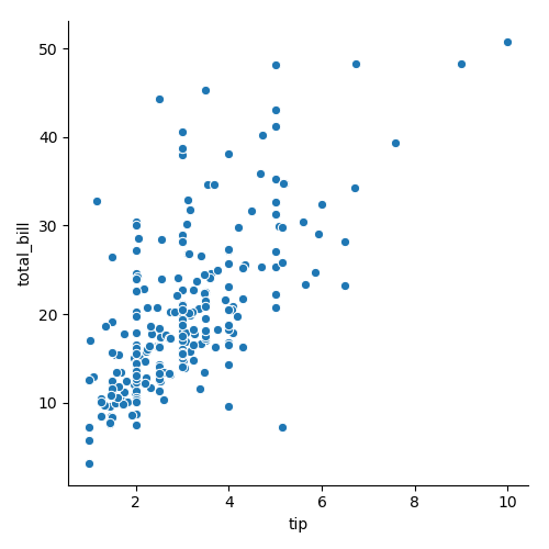
Scatter plot or scatter graph:
The relplot() method is used to get the scatter graph. In the parameter of relplot method, the tip represents the x-axis of the graph whereas the total_bill represents the y-axis of the graph. The third parameter data have the name of the data frame whose data will be used to get the scatter plot.
import seaborn as sb
import matplotlib.pyplot as plt
import bs4
tips=sb.load_dataset('tips')
sb.relplot(x='tip',y='total_bill',data=tips)
plt.show()
Output:-
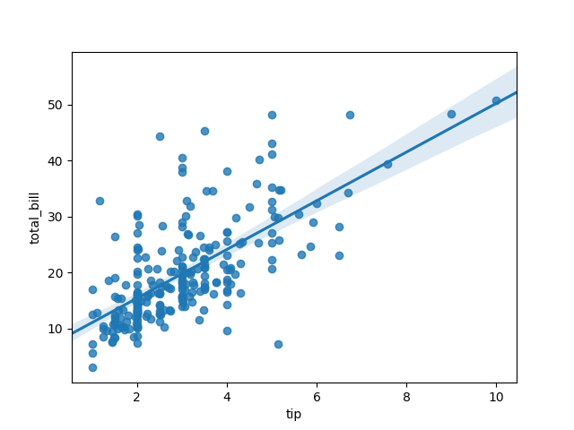
Line graph:
The line graph can be plotted with the help of relplot() method. The kind parameter decides the type of graph. The default value of kind parameter is scatter. The hue parameter has the name of the column as the parameter which will color encode the value of a column in the graph. The aspect parameter is used to wide or zoom the graph.
import seaborn as sb
import matplotlib.pyplot as plt
import bs4
tips=sb.load_dataset('tips')
sb.relplot(x='tip', y='total_bill', data=tips, kind='line', hue='sex', aspect=2)
plt.show()
Output:-

Regression graph:
The regplot() or lmplot() can be used to make the regression graph.
import seaborn as sb
import matplotlib.pyplot as plt
import bs4
tips=sb.load_dataset('tips')
sb.regplot(x='tip', y='total_bill', data=tips)
plt.show()
Output:-
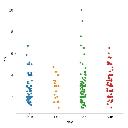
Categorical plot:
The catplot() method will plot the categorical graph.
import seaborn as sb
import matplotlib.pyplot as plt
import bs4
tips=sb.load_dataset('tips')
sb.catplot(x='day',y='tip',data=tips)
plt.show()
Output:-
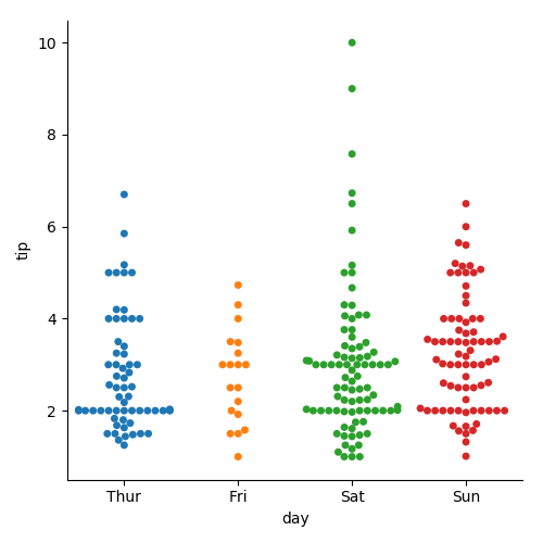
Swarm plot:
The swarm value of kind parameter will avoid the overlapping between the different (x,y) points.
import seaborn as sb
import matplotlib.pyplot as plt
import bs4
tips=sb.load_dataset('tips')
sb.catplot(x='day',y='tip',data=tips,kind='swarm')
plt.show()
Output:-
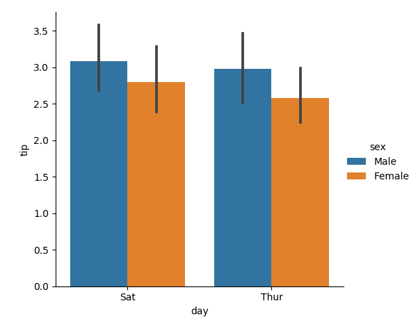
Bar graph:
The order parameter will make the bar graph between those values which are mentioned in the parameter (i.e., it will make a bar graph between ‘Sat’ and ‘Thur’.
import seaborn as sb
import matplotlib.pyplot as plt
import bs4
tips=sb.load_dataset('tips')
sb.catplot(x='day',y='tip',data=tips,kind='bar',hue='sex',order=['Sat','Thur'])  # to make bar graph
plt.show()
Output:-
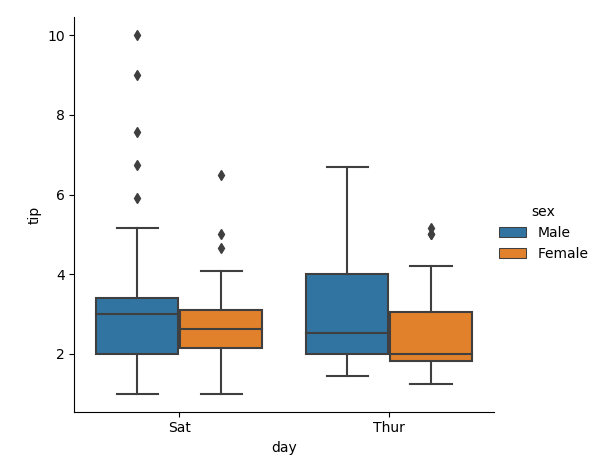
Box graph:
The box graph represents the median, maximum, minimum in the graph.
import seaborn as sb
import matplotlib.pyplot as plt
import bs4
tips=sb.load_dataset('tips')
sb.catplot(x='day',y='tip',data=tips,kind='box',hue='sex',order=['Sat','Thur'])
plt.show()
Output:-
 Histogram:
The distplot() method is used to obtain the histogram. Bins are the building blocks of the histogram. The more number of bins means that more clarity in the histogram.
import seaborn as sb
import matplotlib.pyplot as plt
import bs4
tips=sb.load_dataset('tips')
sb.distplot(a=tips.total_bill,bins=20)
plt.show()
Output:-

Check out the other tutorials on Python:
Leave a Reply