Visualize data from CSV file in Python
 By Nitesh Jhawar
In today’s world, visualizing data is an important part of any domain. Visualized data is easy to understand that is why it is preferred over excel sheets. Python came to our rescue with its libraries like pandas and matplotlib so that we can represent our data in a graphical form.
In this tutorial, we will be learning how to visualize the data in the CSV file using Python.
Visualize a Data from CSV file in Python
First of all, we need to read data from the CSV file in Python.
Now since you know how to read a CSV file, let’s see the code.
import pandas as pd
import matplotlib.pyplot as plt
csv_file='data.csv'
data = pd.read_csv(csv_file)
We have imported matplotlib. It will be used for data visualization.
Let’s see our data.
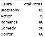
We will now extract Genre and TotalVotes from this dataset.
Votes = data["TotalVotes"]
Genre = data["Genre"]
Now, we will store these data into two different lists. We need to create two empty lists first.
x=[]
y=[]
We will use a method list() which converts a dataset into Python list.
x=list(Genre)
y=list(Votes)
If we print x and y, we get
x=['Biography', 'Action', 'Romance', 'Comedy', 'Horror']
y=[65, 75, 80, 90, 60]
matplotlib lets us draw different types of graphs like,
- Bar charts and Histograms
- Scatter plot
- Stem plots
- Line plots
- Spectrograms
- Pie charts
- Contour plots
- Quiver plots
Today, We will see a scatter plot, bar chart, and pie chart.
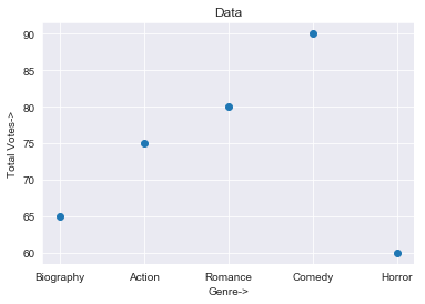
Scatter Plot from CSV data in Python
To draw a scatter plot, we write
plt.scatter(x,y)
plt.xlabel('Genre->')
plt.ylabel('Total Votes->')
plt.title('Data')
plt.show()
xlabel and ylable denote the type of data along the x-axis and y-axis respectively.
plt.title allows us to mention a title for our graph.
To show the graph, we use a function show().
This is our scatter plot.
Bar Plot from CSV data in Python
Similarly, for a bar chart:
plt.bar(x,y)
We get,
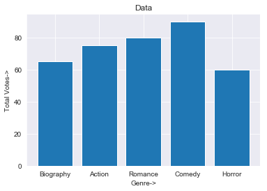
bar plot
Pie Chart from CSV Data in Python
And for the pie chart, we write:
plt.pie(x,labels=y,autopct='%.2f%%')
Here, label is used to provide a name inside the respective portion in the chart.
autopct shows the percentage for each portion.
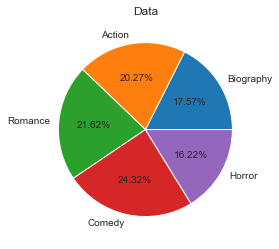
pie chart
So, this is how we can visualize our data using Python. If you have any doubts, don’t forget to mention them in the comment section below.
Also, learn:
Correction: plt.pie(y,labels=x,autopct=’%.2f%%’)
Hi, I tried this code, but the problem is that the kernel keeps running after the plt.show() command. Do you perhaps have an idea how to solve this problem?
Hello,
I’m getting error :-
ValueError: could not convert string to float: ’01 Laptop’
Code :-
csv_file=’tabuladata.csv’
data = pd.read_csv(csv_file)
Item = data[“Item”]
Price = data[“Price”]
x=[]
y=[]
x=list(Item)
y=list(Price)
plt.pie(x,labels=y,autopct=’%.2f%%’)
plt.show()
Probably I need to convert the data type or I messed up with something else.