How to Fill area with color in matplotlib with Python
 By Sachin Rastogi
In this article, we are going to learn how to fill the area of any figure with color in matplotlib using Python. For this, we need some basic concept of two popular modules of Python in the world of plotting figure or any diagram i.e. “numpy” and “matplotlib“.
Filling area with color in matplotlib using Python
We will use the inbuilt function “plt.fill_between()“, this function takes two argument x and y, which denotes from where to where the color will be filled in the figure. Let us see with some examples:-
Fill color between x-axis and curve in matplotlib
import matplotlib.pyplot as plt
import numpy as np

x = np.arange(0,10,0.1)
y = x**2

plt.plot(x,y,'k--')

plt.fill_between(x, y, color='#539ecd')

plt.grid()
plt.show()
Output:

In the above example, first, we imported two required module named as matplotlib and numpy by writing these two lines of codes :-
- import matplotlib.pyplot as plt
- import numpy as np
then we create a numpy array and stored in a variable named as x and then we established a relation between x and y that “y = x**2” and then we used the function “plt.fill_between” to fill the color between x-axis and curve. And then we use “plt.grid()” to mark grid on the figure.
Filling color between y-axis and curve in matplotlib
import matplotlib.pyplot as plt
import numpy as np

x = np.arange(0,10,0.1)
y = x**2

plt.plot(x,y,'k--')

plt.fill_between(x, y, np.max(y), color='#539ecd')

plt.grid()
plt.show()
Output:
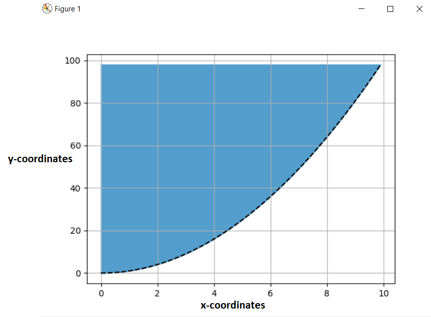
The explanation for the above example is as same as the first example. The only change we added to this is that we added one extra argument inside the “plt.fill_between” function.
Fill color between two curves in matplotlib
import matplotlib.pyplot as plt
import numpy as np

def f1(x):
    return 1.0 / np.exp(x)
def f2(x):
    return np.log(x)

x = np.arange(0.01,10,0.1)

y1 = f1(x)
y2 = f2(x)

plt.plot(x,y1,'k--')
plt.plot(x,y2,'k--')

plt.fill_between(x, y1, y2, color='#539ecd')

plt.grid()

plt.xlim(0,10)
plt.ylim(-1,2.5)

plt.show()
Output:
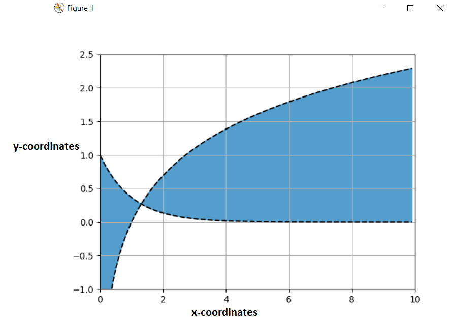
In the above example, the only changes we made are that we plotted two curves in a single figure, and then we use the function for filling the color between these two curves. And we also used the “plt.xlim” and “plt.ylim” to limit the x-axis and y-axis coordinates.
You can also read the following articles:-
Leave a Reply