Make Grouped Violinplot with Seaborn in Python
 By Khushi Aswani
In this tutorial, we will learn how to make grouped voilinplot with the help of seaborn library in Python.
About VoilinPlot:
Before heading towards the implementation of voilinplot, first, we should go through the definition and some basic information about voilinplot.
A voilinplot, in general, is a combination of a boxplot and a kernel density estimate (KDE), which is a method to plot numerical data.

As you can see in the above picture, the median of boxplot(a line), voilinplot(a point) is shown.
IQR(interquartile range) which is 25% to 75% of data is depicted.
Here we have completed the basics of Voilinplot. Now, let’s move to the code section.
Mostly, Voilinplot is used to observe the distribution of numeric data and the comparison of distribution between multiple groups.
First of all, make sure you have following libraries installed on your machine:
- seaborn
- pandas
- matplotlib
Import libraries
Open your jupyter notebook and start importing the libraries as
import seaborn as sns
Most of the time, seaborn installs matplolib, pandas, numpy and other libraries by itself, but in case you get errors import them separately.
Now, the very first step is to load dataset ‘tips’ from seaborn. For this, you need to do is-
tips = sns.load_dataset("tips")
After loading the dataset, Let us fetch its shape
tips.shape
It returns
(244, 7)
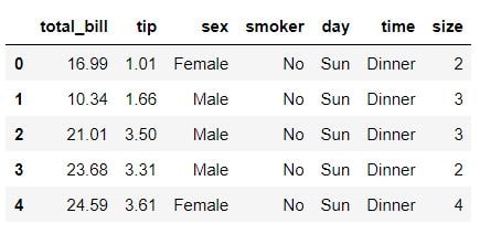
This means we have successfully loaded our dataset. Now, let’s have a look at some of the data
tips.head()
Now, let’s move towards the plotting of a voilinplot. Considering the data ‘tips’, gender on the x-axis, tip on the y-axis, we are trying to plot a voilinplot using seaborn library.
We have set the title as Distribution of tips and font size as 16.
ax = sns.violinplot(x="sex", y="tip", data=tips)
ax.set_title('Distribution of tips', fontsize=16);
We will get a figure shown in the image below:

If we want to see 25%,50%,75% of the data we can write inner=” quartile” when plotting voilinplot as
ax = sns.violinplot(x="sex", y="tip",inner="quartile", data=tips)
ax.set_title('Distribution of tips', fontsize=16);
We will get the same figure with dotted lines depicting 25%, 75%, and a bold line shown 50%.

Suppose we want the information about the total bill amount per day and split it according to gender. We will plot a voilinplot as-
ax = sns.violinplot(x="day", y="total_bill", hue="sex", data=tips)
ax.set_title('Total bill amount/day', fontsize=20);
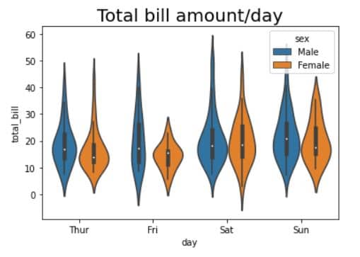
Here we are getting symmetric 8 voilins, but if we need asymmetric voilins and male, female on each side of the violin, we will write split=True. So we will get 4 voilins instead of 8.

This was the required output.
I hope you were able to understand voilinplot and its basics. Feel free to leave a comment and share your reviews.
Leave a Reply