How to plot pie chart in excel sheet using Python
 By Mariya Banatic J
After this tutorial, you will be able to plot a pie chart in an excel sheet using Python. We will use the xlsxwriter module that is available in Python. First, you have to know about the xlsxwriter module.
xlsxwriter:
xlsxwriter is a library in Python that is used to perform operations on excel files. Using the xlsxwriter library, we can do the following operation.
we can,
- Create an excel file
- Write to an excel file
- Perform arithmetic operations
- Plot charts
- Merge cells
- Perform data validation.
Program
- At first, we have imported the xlsxwriter module.
- Then we created a workbook object using Workbook() that takes the filename as the argument.
- After that, the workbook object is used to add a new worksheet using the add_worksheet() method.
- And then, we created a format object to format cells in worksheets using the add_format() method.
- Then we created data lists called head and data.
- We have written those data along the row and column using write_row() and write_column() methods. write_row() and write_column() methods take cell, data, font format as arguments.
- Next, we created a chart object which can be added to a worksheet using the add_chart() method. The add_chart() method takes a type of chart as an argument.
- Then we added a data series to a chart using the add_series() method.
- The set_title() method is used to set the chart title.
- We can set the style of an excel chart using the set_style() method.
- The insert_chart() method is used to insert the chart into the excel sheet.
- At last, we closed the excel file using the close() method.
Let’s take a look at the implementation.
import xlsxwriter
wbook = xlsxwriter.Workbook('PieChart.xlsx')
wsheet = wbook.add_worksheet()
font = wbook.add_format({'bold': 1})
head = ['Vehicle', 'Count']
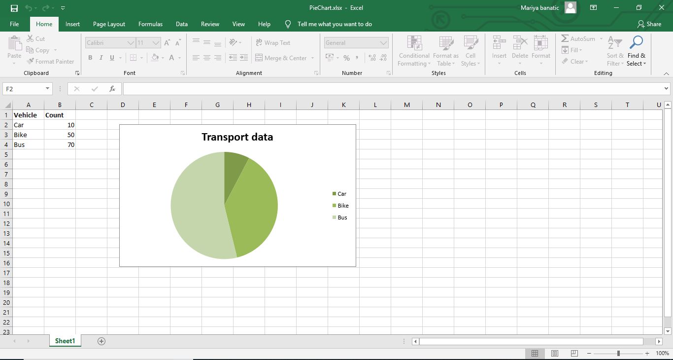
data = [ ['Car', 'Bike', 'Bus'],[10, 50, 70],]
wsheet.write_row('A1', head, font)
wsheet.write_column('A2', data[0])
wsheet.write_column('B2', data[1])
chart = wbook.add_chart({'type': 'pie'})
chart.add_series({
'name': 'Transport data',
'categories': ['Sheet1', 1, 0, 3, 0],
'values': ['Sheet1', 1, 1, 3, 1],
})
chart.set_title({'name': 'Transport data'})
chart.set_style(5)
wsheet.insert_chart('D2', chart, {'x_offset': 25, 'y_offset': 10})
wbook.close()
After executing the above Python code, our excel sheet will look like below,
I hope that you learned something new from this tutorial.
Leave a Reply