Fitting dataset into Linear Regression model
 By Purnendu Das
Hi, today we will learn how to extract useful data from a large dataset and how to fit datasets into a linear regression model. We will do various types of operations to perform regression. Our main task to create a regression model that can predict our output. We will plot a graph of the best fit line (regression) will be shown. We will also find the Mean squared error, R2score. Finally, we will predict one sample. At first, we should know about what is Regression?
What is regression?
Basically, regression is a statistical term, regression is a statistical process to determine an estimated relationship of two variable sets.

linear regression diagram – Python
In this diagram, we can fin red dots. They represent the price according to the weight. The blue line is the regression line.
Python linear regression example with dataset
Let’s go for the coding section:
Requirements:
- Dataset :
- Numpy Library
- Pandas Library
- Matplotlib Library
- SKlearn Library (sci-kit learn)
import pandas as pd
import numpy as np
import matplotlib.pyplot as plt
from sklearn.model_selection import train_test_split
from sklearn.linear_model import LinearRegression
from sklearn.metrics import r2_score,mean_squared_error
%matplotlib inline

df = pd.read_csv('car_data.csv') # Importing the dataset
df.sample(5) #previewing dataset randomly
Output:
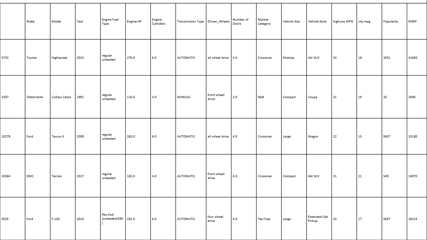
Then we import the car dataset. And print 5 sample dataset values. At first, we imported our necessary libraries.
print(df.shape) # view the dataset shape
print(df['Make'].value_counts()) # viewing Car companies with their cars number
output:
(11914, 16)
new_df = df[df['Make']=='Volkswagen'] # in this new dataset we only take 'Volkswagen' Cars
print(new_df.shape) # Viewing the new dataset shape
print(new_df.isnull().sum()) # Is there any Null or Empty cell presents
new_df = new_df.dropna() # Deleting the rows which have Empty cells
print(new_df.shape) # After deletion Vewing the shape
print(new_df.isnull().sum()) #Is there any Null or Empty cell presents
new_df.sample(2) # Checking the random dataset sample
Output:
(809, 16)
Make                   0
Model                  0
Year                   0
Engine Fuel Type       0
Engine HP              0
Engine Cylinders       4
Transmission Type      0
Driven_Wheels          0
Number of Doors        0
Market Category      224
Vehicle Size           0
Vehicle Style          0
highway MPG            0
city mpg               0
Popularity             0
MSRP                   0
dtype: int64
(581, 16)
Make                 0
Model                0
Year                 0
Engine Fuel Type     0
Engine HP            0
Engine Cylinders     0
Transmission Type    0
Driven_Wheels        0
Number of Doors      0
Market Category      0
Vehicle Size         0
Vehicle Style        0
highway MPG          0
city mpg             0
Popularity           0
MSRP                 0
dtype: int64
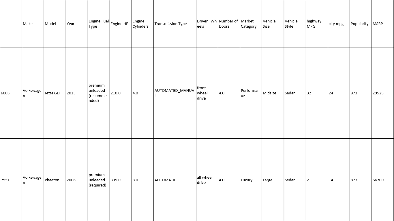
table-2
Here we select only ‘Volkswagen’ cars from the large dataset. Because different types of cars have different brand value and higher or lower price. So we take only one car company for better prediction.
Then we view the shape and check if any null cell present or not. We found there are many null cells present. We delete those rows which have null cells. It is very important when you make a dataset for fitting any data model. Then we cross check if any null cells present or not. No null cell found then we print 5 sample dataset values.
new_df = new_df[['Engine HP','MSRP']] # We only take the 'Engine HP' and 'MSRP' columns
new_df.sample(5) # Checking the random dataset sample
Output:
| Engine HP | MSRP | |
|---|---|---|
| 5423 | 292.0 | 40475 |
| 5467 | 170.0 | 22695 |
| 10539 | 240.0 | 52245 |
| 6037 | 210.0 | 24535 |
| 5342 | 200.0 | 24845 |
Here we select only 2 specific (‘Engine HP’ and ‘MSRP’) columns from all columns. It is very important to select only those columns which could be helpful for prediction. It depends on your common sense to select those columns. Please select those columns that wouldn’t spoil your prediction. After select only 2 columns, we view our new dataset.
X = np.array(new_df[['Engine HP']]) # Storing into X the 'Engine HP' as np.array
y = np.array(new_df[['MSRP']]) # Storing into y the 'MSRP' as np.array
print(X.shape) # Vewing the shape of X
print(y.shape) # Vewing the shape of y
Output:
(581, 1)
(581, 1)
Here we put the ‘Engine HP’ column as a numpy array into ‘X’ variable. And ‘MSRP’ column as a numpy array into ‘y’ variable. Then check the shape of the array.
plt.scatter(X,y,color="red") # Plot a graph X vs y
plt.title('HP vs MSRP')
plt.xlabel('HP')
plt.ylabel('MSRP')
plt.show()
Output:

HP vs MRSP scatter plot graph
Here we plot a scatter plot graph between ‘MSRP’ and ‘HP’. After viewing this graph we ensured that we can perform a linear regression for prediction.
X_train,X_test,y_train,y_test = train_test_split(X,y,test_size = 0.25,random_state=15) # Spliting into train & test dataset
regressor = LinearRegression() # Creating a regressior
regressor.fit(X_train,y_train) # Fiting the dataset into the model
Output:
LinearRegression(copy_X=True, fit_intercept=True, n_jobs=None,
         normalize=False)
Here we split our ‘X’ and ‘y’ dataset into ‘X_train’, ‘X_test’ and ‘y_train’, ‘y_test’. Here we take 25% data as test dataset and remaining as train dataset. We take the random_state value as 15 for our better prediction. We create regressor. And we fit the X_train and y_train into the regressor model.
plt.scatter(X_test,y_test,color="green") # Plot a graph with X_test vs y_test
plt.plot(X_train,regressor.predict(X_train),color="red",linewidth=3) # Regressior line showing
plt.title('Regression(Test Set)')
plt.xlabel('HP')
plt.ylabel('MSRP')
plt.show()
Output:
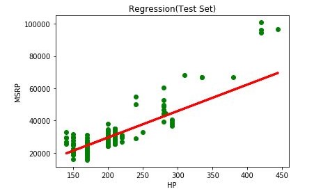
X_test vs y_test with regression line graph
Here we plot a scatter plot graph between X_test and y_test datasets and we draw a regression line.
plt.scatter(X_train,y_train,color="blue")  # Plot a graph with X_train vs y_train
plt.plot(X_train,regressor.predict(X_train),color="red",linewidth=3) # Regressior line showing
plt.title('Regression(training Set)')
plt.xlabel('HP')
plt.ylabel('MSRP')
plt.show()
Output:
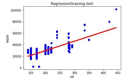
X_train vs y_train scatterplot with best-fit regression line
Here we plot the final X_train vs y_train scatterplot graph with a best-fit regression line. Here we can clearly understand the regression line.
y_pred = regressor.predict(X_test)
print('R2 score: %.2f' % r2_score(y_test,y_pred)) # Priniting R2 Score
print('Mean squared Error :',mean_squared_error(y_test,y_pred)) # Priniting the mean error
Output:
R2 score: 0.73
Mean squared Error : 55796476.51179164
def car_price(hp): # A function to predict the price according to Horsepower
    result = regressor.predict(np.array(hp).reshape(1, -1))
    return(result[0,0])

car_hp = int(input('Enter Volkswagen cars Horse Power : '))
print('This Volkswagen Prce will be : ',int(car_price(car_hp))*69,'₹')
Output:
Note: The whole code is available into jupyter notebook format (.ipynb) you can download/see this code. Link- Linear Regression-Car download
You may like to read:
Hello sir,
You have provided us a very useful article and i appreciate as you keep it in simple language.
But you haven’t check the problem of simultaneous, multicollinearity, hetroscedasticity etc.
add an example of outlier removal when the graph shows one?
You are tricking people into reading your article with bad SEO.
With just 11914 rows, its a joke at best to say that you are fitting large datasets. How about posting content with some actual value, say training a model on a dataset with 50 million rows and 100 columns.
The real challenge starts then.