Analyse UBER Data in Python Using Machine Learning
 By Yash Gandhi
Looking at Data find that the data is increasing day by day and approx 2.5 quintillion bytes of data generate every day. Now, from this data analysis and get useful information which is most important and to understand that here we perform data analysis on UBER data using machine learning in Python.
What is data analysis?
The process of cleaning, transforming, manipulating data into useful information that is Data analysis. When we take a particular decision based on previous data that is data analysis. We can make future decisions using data analysis.
Why we use data analysis?
All the business has lots of data. To grow business, sometimes data analysis required. By analyzing data we get important topics on which work out and make our plan for the future through which made perfect future decisions. Most of the businesses going online where the data generate increases day by day. To grow business with this competitive environment data analysis is necessary.
UBER Data analysis in Python
Dataset is on Kaggle. You can download from it here: UBER dataset
Here, we perform a data analysis task in four steps.
Step-1 Importing libraries and read the data
import pandas as pd
import numpy as np
import datetime
import matplotlib
import matplotlib.pyplot as plt
import seaborn as sns
matplotlib.style.use('ggplot')
import calendar
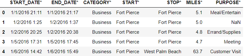
data=pd.read_csv('Uber Drives.csv')
data.head()
Output:
Step-2 Cleaning the data
data.tail()
Output:

data=data[:-1]
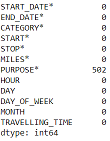
Checking for null values from data.
data.isnull().sum()
Output:
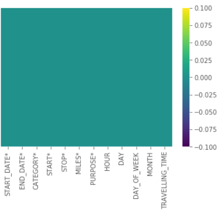
sns.heatmap(data.isnull(),yticklabels=False,cmap="viridis")
Output:

Drop/remove the null values from the data.
data=data.dropna()
sns.heatmap(data.isnull(),yticklabels=False,cmap="viridis")
Output:
Step-3 Transforming the data
Getting an hour, day, days of the week, a month from the date of the trip.
data['START_DATE*'] = pd.to_datetime(data['START_DATE*'], format="%m/%d/%Y %H:%M")
data['END_DATE*'] = pd.to_datetime(data['END_DATE*'], format="%m/%d/%Y %H:%M")
hour=[]
day=[]
dayofweek=[]
month=[]
weekday=[]
for x in data['START_DATE*']:
    hour.append(x.hour)
    day.append(x.day)
    dayofweek.append(x.dayofweek)
    month.append(x.month)
    weekday.append(calendar.day_name[dayofweek[-1]])
data['HOUR']=hour
data['DAY']=day
data['DAY_OF_WEEK']=dayofweek
data['MONTH']=month
data['WEEKDAY']=weekday
Finding traveling time.
time=[]
data['TRAVELLING_TIME']=data['END_DATE*']-data['START_DATE*']
for i in data['TRAVELLING_TIME']:
    time.append(i.seconds/60)
data['TRAVELLING_TIME']=time
data.head()
Output:
![data['TRAVELLING_TIME']=data['END_DATE*']-data['START_DATE*']](https://www.codespeedy.com/wp-content/uploads/2020/04/O3-2.png)
Calculating the average speed of the trip.
data['TRAVELLING_TIME']=data['TRAVELLING_TIME']/60
data['SPEED']=data['MILES*']/data['TRAVELLING_TIME']
data.head()
Output:
![data['TRAVELLING_TIME']=data['END_DATE*']-data['START_DATE*']](https://www.codespeedy.com/wp-content/uploads/2020/04/O16-1.png)
Step-4 Visualizing the data
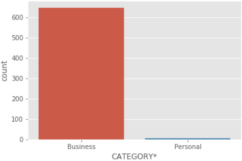
Different categories of data. From data, we can see most of the people use UBER for business purposes.
sns.countplot(x='CATEGORY*',data=data)
Output:
Histogram for miles. Most of people not having a long trip.
data['MILES*'].plot.hist()
Output:
![data['MILES*'].plot.hist()](https://www.codespeedy.com/wp-content/uploads/2020/04/O9-2.png)
Trips for purpose. Mostly the purpose of the trip is meeting and meal/entertain.
data['PURPOSE*'].value_counts().plot(kind='bar',figsize=(10,5),color='blue')
Output:
![data['PURPOSE*'].value_counts().plot(kind='bar',figsize=(10,5),color='blue')](https://www.codespeedy.com/wp-content/uploads/2020/04/O14-1.png)
Trips per hour of the day.
data['HOUR'].value_counts().plot(kind='bar',figsize=(10,5),color='green')
Output:
![data['HOUR'].value_counts().plot(kind='bar',figsize=(10,5),color='green')](https://www.codespeedy.com/wp-content/uploads/2020/04/O13-1.png)
Trips per day of a week. The highest number of trip on Friday.
data['WEEKDAY'].value_counts().plot(kind='bar',color='green')
Output:
![data['WEEKDAY'].value_counts().plot(kind='bar',color='green')](https://www.codespeedy.com/wp-content/uploads/2020/04/O20-1.png)
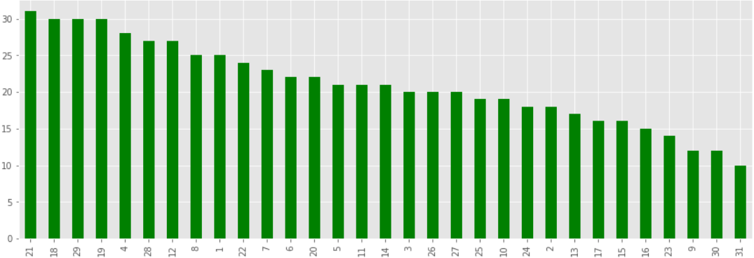
Trips per day of the month
data['DAY'].value_counts().plot(kind='bar',figsize=(15,5),color='green')
Output:
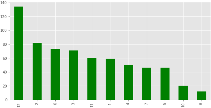
Trips in a month.
data['MONTH'].value_counts().plot(kind='bar',figsize=(10,5),color='green')
Output:
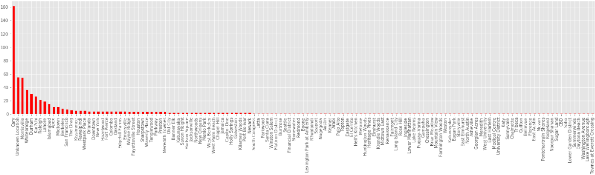
The starting points of trips. The highest number of people are from Cary who takes the trip.
data['START*'].value_counts().plot(kind='bar',figsize=(25,5),color='red')
Output:
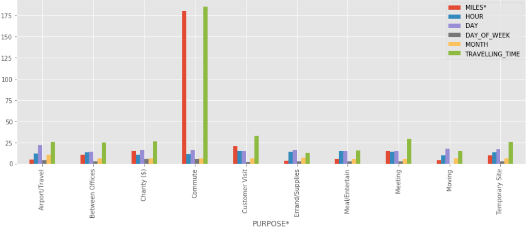
Comparing all the purpose with miles, hour, day of the month, day of the week, month, Travelling time.
data.groupby('PURPOSE*').mean().plot(kind='bar',figsize=(15,5))
Output:
Dataset is on Kaggle. You can download from it here: UBER dataset
Conclusion
Here, we see the following topics:
- Data analysis
- Use of data analysis
- UBER data analysis in Python.
Also read: Machine Learning Model to predict Bitcoin Price in Python
hello sir i need a report document for this project kindly please send me to the email
Bruh i need a report document too for this project kindly please send me to the email
Sir, can i get a report documentation too for this project?, kindly please send me to the email(joshichinmay296@gmail.com)