Draw a frequency histogram in Python
 By Abul Hassan
In this tutorial, we learn how to draw a frequency histogram in Python.
Frequency histograms are used to represent the frequency or count of an outcome in a data set. Frequency histograms make data looks more professional and well organized. it gives a clear visual representation of the data
We can plot a frequency histogram by using built-in data visualization tools in python. It’s better to do the coding in Jupyter Notebook which can give out the best possible data visualization.
Here we use Pandas library for plotting the frequency histogram. In Jupyter Notebook,
We import pandas library. pandas library is used to manipulate numbers, tables and other data sets.
import numpy as np
import pandas as pd
import matplotlib.pyplot as plt
%matplotlib inline
We import matlpotlib.pyplot to get various functions to style the histogram.
To read a data set:
df= pd.read_csv('sample_set.csv')
Here we read a CSV data set named sample_set to a variable named df. You can read the desired data for which you want to draw the frequency histogram. you can also download lots of data sets from kaggle.
df['col_name']
You can see the histogram formed in the link given below

Specify which column you want to plot in the histogram as col_name. This will visualize the frequency histogram of the column specified as ‘col_name’ of the data set.
matplotlib provides various style functions to modify your plotes and to make them look better. You can check various styling options by clicking this link: Style Sheet
Some examples of using style functions are shown below.
-
plt.style.use('ggplot')
df1['col_name'].hist()
-
plt.style.use('bmh')
df1['col_name'].hist()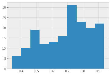
-
plt.style.use('dark_background')
df1['col_name'].hist()
Leave a Reply