Bootstrap 4 List Groups with examples
 By Hussain Quadri
In this tutorial, we will look List Groups in Bootstrap 4.
Bootstrap framework provides multiple styles for every element on a website. In bootstrap 4, there are many styles for the default list.
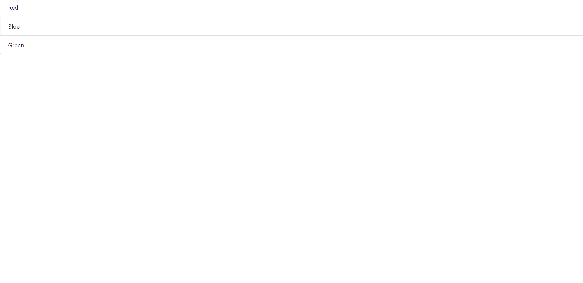
The most basic list group is given below:
Class .list-group is used for creating a list of group, and class .list-group-item is used for elements.
Code :
<ul class="list-group">
<li class="list-group-item ">Red</li>
<li class="list-group-item">Blue</li>
<li class="list-group-item">Green</li>
</ul>
Below is what we see for the above HTML code using the bootstrap 4:
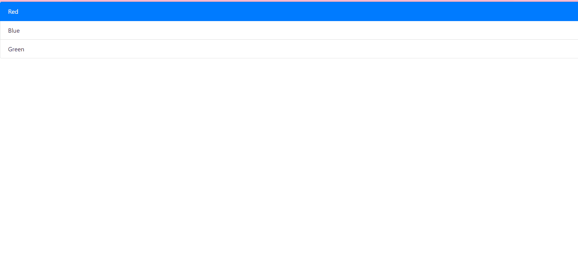
Active state
This is used to highlight the present item. Class .active is used to represent the active state.
Code:
<ul class="list-group">
<li class="list-group-item active">Red</li>
<li class="list-group-item">Blue</li>
<li class="list-group-item">Green</li>
</ul>
Output :
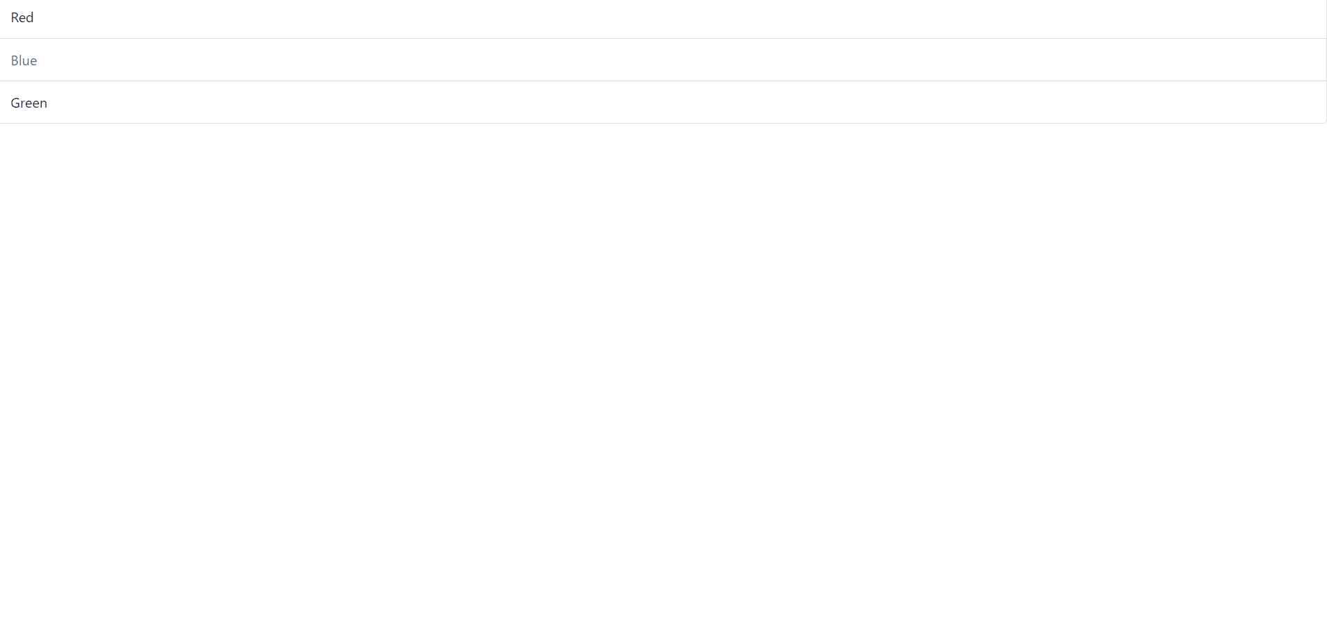
Disabled Items:
It is used to disable the group item. Class .disabled is used for disabling.
Code:
<ul class="list-group">
<li class="list-group-item ">Red</li>
<li class="list-group-item disabled">Blue</li>
<li class="list-group-item">Green</li>
</ul>
In the code above, the first element in the list which is Blue is disabled.
Output :
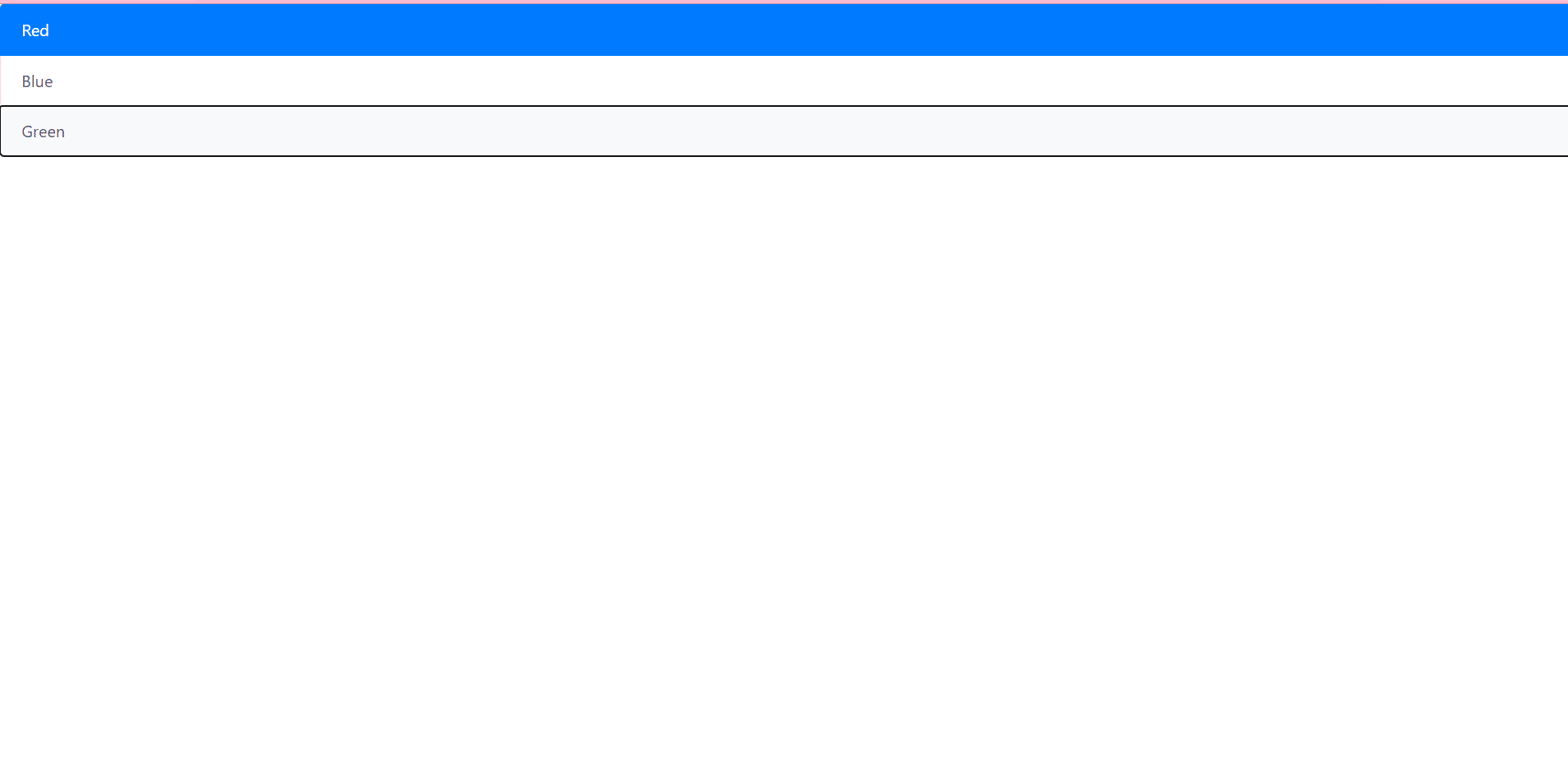
Links and buttons:
By using <a> or <button> we can create actionable list group items with disabled,hover and active states by using .list-group-item-action.
Code:
<div class="list-group">
<a href="#" class="list-group-item list-group-item-action active">
Red
</a>
<a href="#" class="list-group-item list-group-item-action">Blue</a>
<a href="#" class="list-group-item list-group-item-action disabled">Green</a>
</div>
In the above example, we can see that it will be actionable when the mouse hovers on the list element.
Output:

By using buttons, you can use disabled attribute because we can’t use it in <a> as it is not supported by <a> tag.
Code :
<div class="list-group">
<button type="button" class="list-group-item list-group-item-action active">Red</button>
<button type="button" class="list-group-item list-group-item-action">Blue</button>
<button type="button" class="list-group-item list-group-item-action" disabled>Green</button>
</div>
Output :
Flush:
Removing the border, adding roundness to the list elements involves the use of .list-group-flush class.
Code :
<ul class="list-group list-group-flush">
<li class="list-group-item">Red</li>
<li class="list-group-item">Blue</li>
<li class="list-group-item">Green</li>
</ul>
Output:

Leave a Reply