How to Add an Average Line to Plot in Matplotlib
 By Isha Bansal
Hey fellow Python coder! In this tutorial, we will learn how to add an average line to Ordinary Matplotlib Plots using Python programming. To make sure we are connected to the real world, we will be sticking to our old friend, the Iris Dataset.
Let’s get started!
We will start by importing the data into our system using the seaborn library which has a direct functionality to load the iris dataset. This can be achieved using the load_datasets function and pass iris to the function as a parameter. Have a look at the code snippet below:
import seaborn as sns

iris = sns.load_dataset('iris')
print(iris)
The result of the code is as shown below:
     sepal_length  sepal_width  petal_length  petal_width    species
0             5.1          3.5           1.4          0.2     setosa
1             4.9          3.0           1.4          0.2     setosa
2             4.7          3.2           1.3          0.2     setosa
3             4.6          3.1           1.5          0.2     setosa
4             5.0          3.6           1.4          0.2     setosa
..            ...          ...           ...          ...        ...
145           6.7          3.0           5.2          2.3  virginica
146           6.3          2.5           5.0          1.9  virginica
147           6.5          3.0           5.2          2.0  virginica
148           6.2          3.4           5.4          2.3  virginica
149           5.9          3.0           5.1          1.8  virginica

[150 rows x 5 columns]
As we can see there are multiple numerical values that we can use to compute the average line of the data points. Let’s pick sepals first in the next section.
Also Read: Classification Of Iris Flower using Python – CodeSpeedy
Python Code Implementation for Average Line on Sepals Length and Width
This section covers the practical implementation of the average lines on the iris plot based on the comparison between sepal length and width. Let’s start with a basic plot in the next sub-section.
Basic Plotting
To plot the simple scatter plot, we will make use of the matplotlib library and the scatterplot function under the seaborn library. As we are plotting a comparison between sepal width and length, we will be setting x and y values accordingly. Along with this, we will also mention the dataset as Iris.
import matplotlib.pyplot as plt

plt.figure(figsize=(10, 6))
scatter = sns.scatterplot(x="sepal_length", y="sepal_width", data=iris)
plt.show()
The output of the code when executed is as follows:

Adding Styling to the Basic Plot
The plot looks a little dull, let’s add some creativity to it. To achieve that, we will set the styling of the plot using the style function. Along with this, we will add some additional parameters to the scatterplot function, namely, hue and palette. The hue parameter helps in identifying which data point belongs to which class based on the type of species and the palette parameter defines the color styling which in this case I have used pastel.
sns.set(style="darkgrid")

plt.figure(figsize=(10, 6))
scatter = sns.scatterplot(x="sepal_length", y="sepal_width", data=iris, hue="species", palette="pastel")
plt.legend()
plt.show()
I have also added legend to the plot to make it more labeled and understandable. When the code is executed, we get a prettier plot shown below:

Adding the Average Line to the Plot
Moving on to the main part of the tutorial, we will be plotting a horizontal line on the plot representing the average value of sepal widths present in the dataset. To achieve the same, we will first compute the mean value (as done in Line Number 5) with the help of mean function. Later on, we will be plotting the horizontal line using the axhline function with a few parameters including and label for the legend.
sns.set(style="darkgrid")
plt.figure(figsize=(10, 6))
scatter = sns.scatterplot(x="sepal_length", y="sepal_width", data=iris, hue="species", palette="pastel")

avgSepalWidth = iris['sepal_width'].mean()
scatter.axhline(y=avgSepalWidth, color='r', linestyle='--', label=f'Average Sepal Width is ({avgSepalWidth:.2f})')
plt.legend()
plt.show()
When the code is executed, we get a prettier plot shown below:

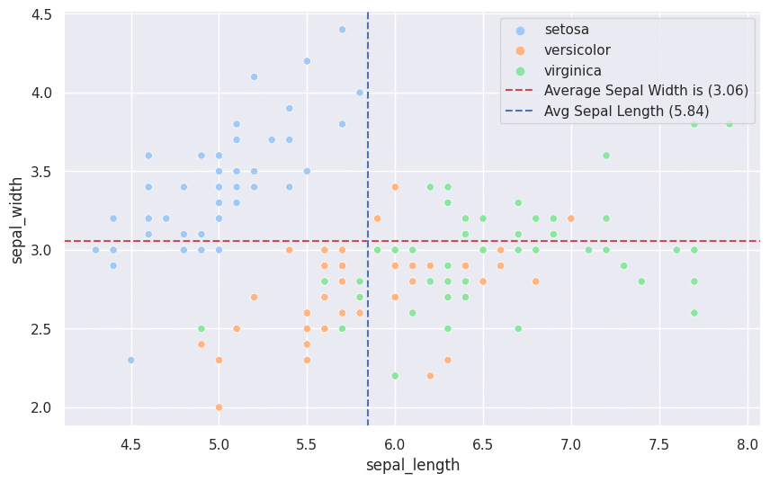
You can see the average line on the plot based on the sepal width of the flowers. What if we also want a vertical average line based on the values of the sepal lengths of the flowers? To achieve the vertical line we will make use of the axvline function and the rest of the logic remains the same. Have a look at the code snippet below:
sns.set(style="darkgrid")

plt.figure(figsize=(10, 6))
scatter = sns.scatterplot(x="sepal_length", y="sepal_width", data=iris, hue="species", palette="pastel")

avgSepalWidth = iris['sepal_width'].mean()
scatter.axhline(y=avgSepalWidth, color='r', linestyle='--', label=f'Average Sepal Width is ({avgSepalWidth:.2f})')

avgSepalLength = iris['sepal_length'].mean()
scatter.axvline(x=avgSepalLength, color='b', linestyle='--', label=f'Avg Sepal Length ({avgSepalLength:.2f})')

plt.legend()
plt.show()
When the code is executed, we get a prettier plot shown below:
Code Implementation for Average Line on Petals Length and Width
To achieve the same output but for petals length and width, the code and approach remain unchanged except for the target columns. I have mentioned the entire code and output below:
import matplotlib.pyplot as plt
import seaborn as sns

iris = sns.load_dataset('iris')

sns.set(style="darkgrid")
plt.figure(figsize=(10, 6))
scatter = sns.scatterplot(x="petal_length", y="petal_width", data=iris, hue="species", palette="pastel")

avgPetalWidth = iris['petal_width'].mean()
scatter.axhline(y=avgPetalWidth, color='r', linestyle='--', label=f'Average Petal Width is ({avgPetalWidth:.2f})')

avgPetalLength = iris['petal_length'].mean()
scatter.axvline(x=avgPetalLength, color='b', linestyle='--', label=f'Avg Petal Length ({avgPetalLength:.2f})')

plt.legend()
plt.show()

Also Read:
Leave a Reply