Radar chart in pygal
 By Varsha Neelamma
You must be aware that Python provides you with several libraries to facilitate different types of tasks. Pygal is one such Python library that you can use for data visualization. It gives you various ways to draw interactive plots, graphs and charts and to further download them.
In this tutorial, you will learn about radar charts in pygal.
Radar Charts
Radar charts are comparative charts that you can usually use to study the differences between two or more items and their features. It is also called a spider chart or web chart.
Installing pygal
Firstly, ensure that you have the pygal package installed and ready to work.
You can install the pygal library by executing the following command on your terminal;
pip install pygal
Once you have pygal installed, you can create the required graphs with its inbuilt methods.
Begin by importing the library;
import pygal
Once this is done, you can initialize a variable to hold your graph;
eg_chart = pygal.Radar()
Further, you can add the values and dimensions for the chart, and also specify the title of the chart and the colors you would like to use.
import pygal
eg_chart = pygal.Radar()
eg_chart.title = 'An example Radar Chart'
eg_chart.add('One', numpy.random.rand(10))
eg_chart.add('Two', numpy.random.rand(10))
eg_chart.add('Three', numpy.random.rand(10))
eg_chart.add('Four', numpy.random.rand(10))
eg_chart
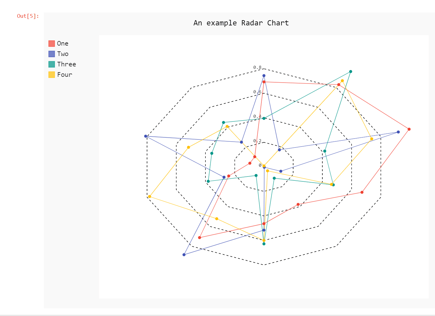
In the above example, we have created a Radar chart titled ‘An example Radar Chart’ with a set of randomly generated values.
If you want to render the output graph on a browser, you can simply use the render_in_browser() method as shown;
import pygal
eg_chart = pygal.Radar()
eg_chart.title = 'An example Radar Chart'
eg_chart.add('One', numpy.random.rand(10))
eg_chart.add('Two', numpy.random.rand(10))
eg_chart.add('Three', numpy.random.rand(10))
eg_chart.add('Four', numpy.random.rand(10))
eg_chart.render_in_browser()
file://C:/Users/varsh/AppData/Local/Temp/tmp4g2oilj4.html
This will display the output in a new HTML window on the browser.
Further, you can customize the colour and other styles for your graph by using the Style class of pygal.
import pygal
from pygal.style import Style
eg_style = Style(colors=('#E80080', '#404040', '#9BC850'),plot_background='#9BC850')
eg_chart = pygal.Radar(style=eg_style)
eg_chart.title = 'An example Radar Chart'
eg_chart.add('One', numpy.random.rand(10))
eg_chart.add('Two', numpy.random.rand(10))
eg_chart.add('Three', numpy.random.rand(10))
eg_chart.add('Four', numpy.random.rand(10))
eg_chart.render_in_browser()

As you can see, we have first defined the style parameters and then passed the same through the style argument.
You can also check out Bar Chart in Pygal.
Leave a Reply