Scatter plot using ggplot2 in Python with customization
 By yaswanth vakkala
Scatter plots are great for visually seeing the relationship between numerical variables. In this tutorial, we will learn how to plot scatter plots in ggplot2 in Python. ggplot2 is a popular R data visualization package, and it can be used in Python using the plotnine package. It provides us with a grammar of graphics making the process of plotting efficient and easy. The usage is also similar to that of ggplot2 in R.
For this tutorial, I will be using a google colab notebook which has the plotnine package preinstalled. Furthermore, I will use the mtcars dataset, which is also a built-in dataset of the plotnine package.
Refer to this article for ggplot2 installation in Python: ggplot2 installation guide
If you choose to use your local environment, then execute the below commands in your system.
pip install plotnine
pip install pandas
Import the required packages and the dataset.
# importing packages
from plotnine import ggplot, aes, geom_point, labs, geom_text, geom_density_2d, geom_smooth
import pandas as pd
# importing dataset
from plotnine.data import mtcars
Scatter plot using ggplot2 in Python
First, use the Pandas head() method to select the first 50 rows of the mtcars dataset for simple visualizations.
df = mtcars.head(50)
Let’s plot a scatter plot using the geom_point() function.
ggplot(df) + aes(x='mpg', y='wt') + labs(
    x='Miles/(US) gallon',
    y='Weight (1000 lbs)',
    title='Miles/(US) gallon vs Weight (1000 lbs)') + geom_point()
Output:

Here’s another example of plotting of scatter plot.
ggplot(df) + aes(x='hp', y='drat') + labs(
    x='Gross horsepower',
    y='Rear axle ratio',
    title='Gross horsepower vs Rear axle ratio') + geom_point()
Output:

Customizing Scatter plots – ggplot2
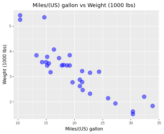
We can change the alpha, size, and color values of the points using arguments inside the geom_point() function.
ggplot(df) + aes(x='mpg', y='wt') + labs(
    x='Miles/(US) gallon',
    y='Weight (1000 lbs)',
    title='Miles/(US) gallon vs Weight (1000 lbs)') + geom_point(alpha = 0.5, size=5, color='blue')
Output:
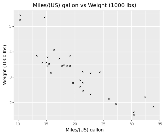
The shape of the points in the plot also can be changed using the shape argument.
ggplot(df) + aes(x='mpg', y='wt') + labs(
    x='Miles/(US) gallon',
    y='Weight (1000 lbs)',
    title='Miles/(US) gallon vs Weight (1000 lbs)') + geom_point(shape='x')
Output:
We can also plot labels as points using the geom_text() function.
ggplot(df) + aes(x='hp', y='drat') + labs(
    x='Gross horsepower',
    y='Rear axle ratio',
    title='Gross horsepower vs Rear axle ratio') + geom_point() + geom_text(label=df['name'])
Output:

The color, shape, and size values of the scatter plot can be dynamically changed using the variables of dataset.
ggplot(df) + aes(x='hp', y='drat', shape='cyl', color='cyl', size='cyl') + labs(
    x='Gross horsepower',
    y='Rear axle ratio',
    title='Gross horsepower vs Rear axle ratio') + geom_point()
Output:

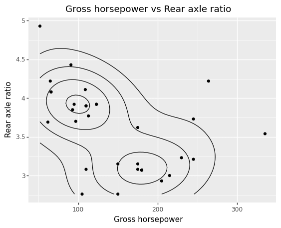
We can also plot a 2d density map using the geom_density_2d() function.
ggplot(df) + aes(x='hp', y='drat') + labs(
    x='Gross horsepower',
    y='Rear axle ratio',
    title='Gross horsepower vs Rear axle ratio') + geom_point() + geom_density_2d()
Output:
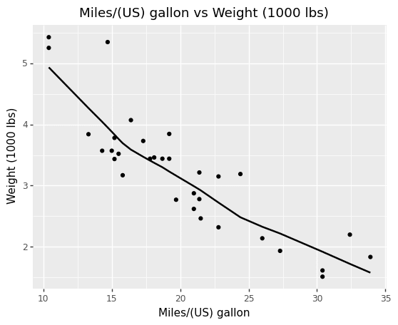
A regression line can be added using the geom_smooth() function.
ggplot(df) + aes(x='mpg', y='wt') + labs(
    x='Miles/(US) gallon',
    y='Weight (1000 lbs)',
    title='Miles/(US) gallon vs Weight (1000 lbs)') + geom_point()+  geom_smooth()
This plot uses the default loess method to estimate the regression line.
Output:
Instead of loess, we can also use a linear model to compute a regression line.
ggplot(df) + aes(x='mpg', y='wt') + labs(
    x='Miles/(US) gallon',
    y='Weight (1000 lbs)',
    title='Miles/(US) gallon vs Weight (1000 lbs)') + geom_point()+  geom_smooth(method='lm')
Output:

There are 2 other functions i.e, stat_smooth() and geom_abline() to calculate the regression line.
Leave a Reply