Place text and an icon side by side using Label in SwiftUI
 By Samim
In this tutorial, we will see how to place text and an icon side by side using Label in SwiftUI.
In SwiftUI, the Label view provides a convenient way to display text and icons side by side within our user interface. This is particularly useful for scenarios such as menus or lists.
Now, have a look at the approaches below to do that.
Using SF Symbols
SF Symbols are a set of icons provided by Apple, and they can be used within SwiftUI easily.
If we want to use SF Symbols within a SwiftUI Label for icons, we can directly use the systemImage as the second parameter of the Label and pass the specified symbol name within a double quotation ("") marks.
Example
Label("Photos", systemImage: "photo")The above code will create a SwiftUI label with the text “Photos” and an associated SF Symbol icon named “photo“.
Output:

Changing the size of the Text and Icon
We can adjust the size of both the text and the icon simultaneously using the font() modifier.
Example
Label("Photos", systemImage: "photo")
    .font(.largeTitle)
In the above code, the Text and the photo symbol are scaled to the largeTitle font size.
Output:

We can also use imageScale() modifier to change the size of the Text and Icon together. This modifier is used to adjust the scale of an image within a view.
Example
VStack(spacing: 20) {
    Label("Photos", systemImage: "photo")
        .imageScale(.small)

    Label("Photos", systemImage: "photo")
        .imageScale(.medium)

    Label("Photos", systemImage: "photo")
        .imageScale(.large)
}
The above code will create a vertical stack of three labels, each will display the text “Photos” with an associated system image of a photo.
The first label will have a smaller-sized image, the second will have a medium-sized image, and the third will have a larger-sized image.
Output:

Changing the color of the Text and Icon
We can also change the color of both the text and the icon simultaneously using the foregroundColor() modifier.
Example
Label("Photos", systemImage: "photo")
    .font(.largeTitle) // To change the size
    .foregroundColor(.mint) // To change the color
In the above program, I have applied the foregroundColor() modifier on the Label and specified the color mint into this modifier. So, it will display the Text and Icon both in mint color.
Output:

Changing the size and color of the Text and Icon separately
We can adjust the size of the text and the system image icon separately by using different modifiers for each element. We can use the font() modifier for the text and the imageScale() modifier for the system image.
For color, we can use the foregroundColor() modifier on each element by specifying different colors.
Example
Label {
    Text("Photos")
        .foregroundColor(.blue)
        .font(.largeTitle)
} icon: {
    Image(systemImage: "photo")
        .foregroundColor(.red)
        .imageScale(.medium)
}
The above code will display a red-colored photo Icon and a blue-colored text “Photos” side by side. The Icon will be smaller than the text “Photos“.
Output:

Using Custom Images
We can use our own images as an icon with the label. In SwiftUI, we have the option to use custom images as icons within a Label.
Example
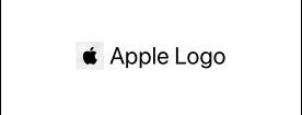
Label {
    Text("Apple Logo")
        .font(.largeTitle)
} icon: {
   Image("picture") // Use your own image file name here
        .resizable() // Make the image resizable to adjust its dimensions
        .scaledToFit() //Maintain the image's aspect ratio
        .frame(width: 40, height: 40) // Set a specific frame size for the image

}
The above code will create a Label displaying “Apple Logo” in a largeTitle font and a custom image as an icon.
Output:
Providing Custom Views
Now, Instead of using the Image or the SF Symbol, we can also use shapes like Circle, RoundedRectangle, etc provided by SwiftUI.
Example
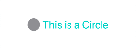
Label {
    Text("This is a Circle")
        .font(.largeTitle)
        .foregroundColor(.mint)
} icon: {
    Circle()
        .fill(.gray) //Fills the circle with a gray color
        .frame(width: 40, height: 40) //Sets the frame size of the circle
}
The above code will display the text “This is a Circle” in a large font with a mint color and a gray-filled circle as an icon.
Output:
Leave a Reply