Merge views in SwiftUI using compositingGroup modifier
 By shagrafnasheet
In this SwiftUI tutorial, we will learn to merge SwiftUI elements into one. And we will learn the usage of the compositing group modifier.
What this blog will cover:
- Custom alert view
- Merging UI elements
- Usage of the compositing group modifier
Create a custom alert view:

We all have seen this type of alert, right? Let’s first create a custom alert view like this in SwiftUI. Then we’ll understand where we need to use this compositingGroup modifier and what it’s used for.
import SwiftUI

struct CompositionGroup: View {

    @State private var rotateShapes = false

    var body: some View {

        ZStack{

            Rectangle()
                .fill(Color.gray.opacity(0.2))
                .frame(maxWidth: .infinity)
                .frame(height: 170)
                .cornerRadius(20, antialiased: /*@START_MENU_TOKEN@*/true/*@END_MENU_TOKEN@*/)
                .padding(10)


            Image(systemName: "multiply")
                .frame(width:50, height: 50)
                .background(Color.red)
                .foregroundColor(.white)
                .imageScale(.large)
                .aspectRatio(contentMode: .fill)
                .cornerRadius(25)
                .offset(y:-85)

            VStack{
                Text("Failure").fontWeight(.bold).padding(.bottom)
                Text("We are unable to process this request please try again later")
                    .padding(.bottom)
                    .fontWeight(.light).multilineTextAlignment(.center)
            }.padding([.top,.leading,.trailing], 20)
        }
        .padding()
    }

}
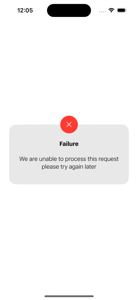
It’s simple and easy. We have used a ZStack so that each view will be on top of the other.
Let’s make a few changes to this custom alert view. We’ll change the background color to white and give it a shadow.
struct CompositionGroup: View {

    @State private var rotateShapes = false

    var body: some View {

        ZStack{

            Rectangle()
                .fill(Color.white)
                .frame(maxWidth: .infinity)
                .frame(height: 170)
                .cornerRadius(20, antialiased: /*@START_MENU_TOKEN@*/true/*@END_MENU_TOKEN@*/)
                .padding(10)


            Image(systemName: "multiply")
                .frame(width:50, height: 50)
                .background(Color.red)
                .foregroundColor(.white)
                .imageScale(.large)
                .aspectRatio(contentMode: .fill)
                .cornerRadius(25)
                .offset(y:-85)

            VStack{
                Text("Failure").fontWeight(.bold).padding(.bottom)
                Text("We are unable to process this request please try again later")
                    .padding(.bottom)
                    .fontWeight(.light).multilineTextAlignment(.center)
            }.padding([.top,.leading,.trailing], 20)
        }

        .shadow(color: Color.black.opacity(0.4), radius: 10)

        .padding()
    }

}
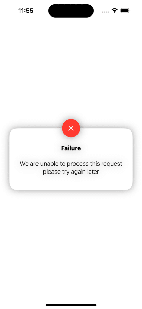
Now you can see that the shadow property we applied to the ZStack is applied to all UI elements inside the ZStack or all the subviews of the ZStack. But we want the shadow to be visible only on the outer side of the alert. So, how will we do that? It is where we need the compositingGroup modifier.
Let’s apply the compositingGroup modifier to the ZStack:
import SwiftUI

struct CompositionGroup: View {

    @State private var rotateShapes = false

    var body: some View {

        ZStack{

            Rectangle()
                .fill(Color.white)
                .frame(maxWidth: .infinity)
                .frame(height: 170)
                .cornerRadius(20, antialiased: /*@START_MENU_TOKEN@*/true/*@END_MENU_TOKEN@*/)
                .padding(10)


            Image(systemName: "multiply")
                .frame(width:50, height: 50)
                .background(Color.red)
                .foregroundColor(.white)
                .imageScale(.large)
                .aspectRatio(contentMode: .fill)
                .cornerRadius(25)
                .offset(y:-85)

            VStack{
                Text("Failure").fontWeight(.bold).padding(.bottom)
                Text("We are unable to process this request please try again later")
                    .padding(.bottom)
                    .fontWeight(.light).multilineTextAlignment(.center)
            }.padding([.top,.leading,.trailing], 20)
        }

        .compositingGroup()
        .shadow(color: Color.black.opacity(0.4), radius: 10)

        .padding()
    }

}
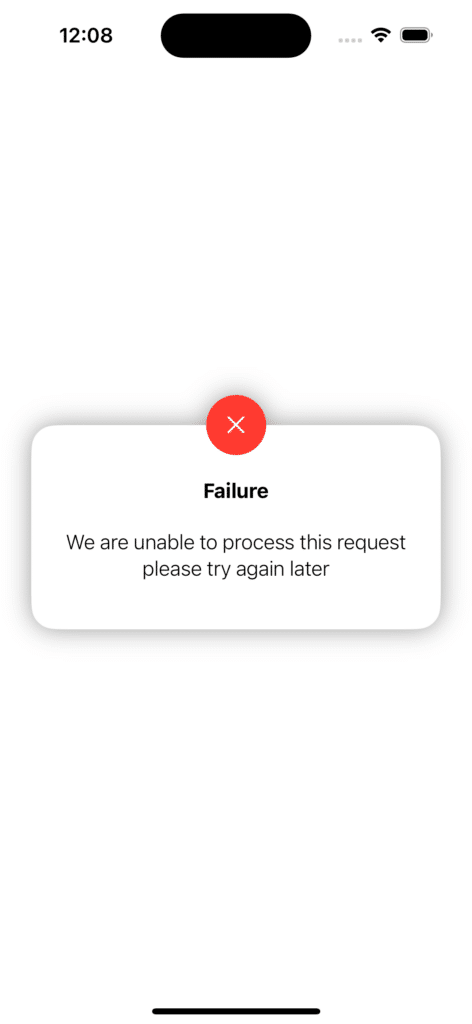
Now, the shadow attribute only affects the outer side of the alert view, exactly as we wanted.
Usage of the compositingGroup modifier:
The compositingGroup modifier merges the subviews of the container it is applied to. And then it renders them as one. Therefore, any modifier you apply after the compositingGroup modifier will affect the ZStack as a whole rather than each subview independently.
Leave a Reply