How to create charts in SwiftUI
 By shagrafnasheet
In this SwiftUI tutorial, we’ll learn how to implement charts in SwiftUI. It’s quite easy to achieve this, all we’ll be doing is importing the SwiftUI charts framework in our project and using it for creating charts.
Key Steps for implementing charts in SwiftUI
- import chart framework
- declare the chart component or data set
- loop through your data set and display each component
Syntax for Charts
Chart {
ForEach(Items, id: \.ID) { item in
 BarMark( x: .value("X", item.type),
         y: .value("Y", item.qty) )
 }
}
Import Charts Framework
let’s start by importing the chart framework into the project.
import ChartsDeclare and initialize the Data set
For the implementation of the charts, we are creating a data set for fruits. Creating a struct named fruit that has two fields, type and qty, will have type as the name of the fruits and qty as the fruit quantity. And make sure to give your structure any unique fields to differentiate between each data item. In this case, the type field will be the unique entity that will be used as an id later in the charts.
Declaring the struct
struct Fruit {

    var type: String

    var qty: Double

}
Declaring and Initializing the fruit dataset Array
 let fruits = [

        Fruit(type: "Apple", qty: 20),

        Fruit(type: "Banana", qty: 40),

        Fruit(type: "Peach", qty: 5)

    ]
Loop through the data set and initialize the chart in SwiftUI
Let’s start…
1) The BarMark Chart
struct Fruit {
    var type: String
    var qty: Double
}

struct Charts: View {

    let fruits = [
        Fruit(type: "Apple", qty: 20),
        Fruit(type: "Banana", qty: 40),
        Fruit(type: "Peach", qty: 5)
    ]

    var body: some View {
        NavigationView{
            ScrollView{
                Chart {
                    ForEach(fruits, id: \.type) { item in
                        BarMark(
                            x: .value("Fruit", item.type),
                            y: .value("Quantity", item.qty)
                        )
                    }
                    .symbol(by: .value("Fruits", "Bar Chart"))
                    .foregroundStyle(Color.red)

                }.frame(height:300)
                    .padding()
                    .navigationTitle("Charts")

         }
      }
    }
  }
In the above code, we have implemented the BarMark chart with the fruit dataset. In the loop, we have given type as the id as it is the unique entity of our dataset and it will be used to differentiate between the other items.
The BarMark chart takes two parameters as input. One for the x value and the second for the y value of the chart.
In the X parameter, you can give the name for the horizontal or x-axis and all the values for the x-axis.
In the Y parameter, you can give the name for the vertical or y-axis and all the values for the y-axis.
And by symbol modifier of the chart, you can give a title to your charts.
.symbol(by: .value("Fruits", "Bar Chart"))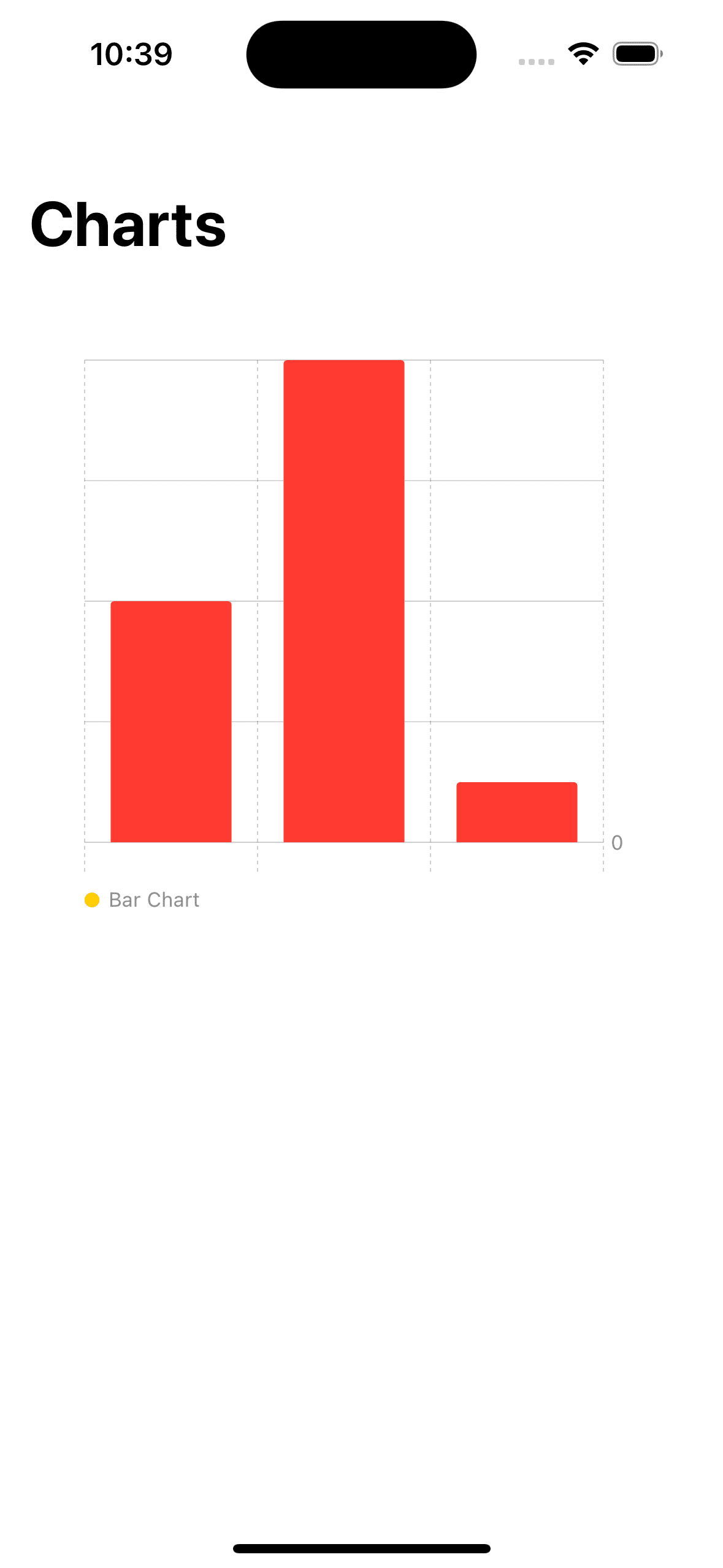
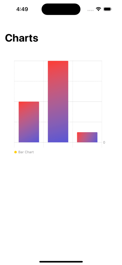
Gradient Color for the charts
In the above chart, the BarkMark chart is in the plain red color, but we can also give it a gradient color.
.foregroundStyle(Color.blue.gradient)

As you can see it’s a very slight red gradient color, but we can also use LinearGradient for providing the charts with more variant gradient colors.
   .foregroundStyle(LinearGradient
                   (colors: [.red,.indigo],
                    startPoint: .topLeading,
                    endPoint: .bottomTrailing))
2) The Line Mark Chart
Other charts can be implemented in a similar way as the barMark chart. We’ll be just changing the barMark to the Line Mark Chart.
struct Charts: View {

    let fruits = [
        Fruit(type: "Apple", qty: 20),
        Fruit(type: "Banana", qty: 40),
        Fruit(type: "Peach", qty: 5)
    ]

    var body: some View {

        NavigationView{
            ScrollView{
                Chart {
                    ForEach(fruits, id: \.type) { item in
                        BarMark(
                            x: .value("Fruit", item.type),
                            y: .value("Quantity", item.qty)
                        )
                    }

                    .symbol(by: .value("Fruits", "Bar Chart"))
                    .foregroundStyle(Color.red.gradient)

                }.frame(height:300)
                    .padding()
                    .navigationTitle("Charts")


                Text("------------------------").foregroundColor(.mint)


                Chart {
                    ForEach(fruits, id: \.type) { item in
                        LineMark(
                            x: .value("Fruit", item.type),
                            y: .value("Quantity", item.qty)
                        )
                    }

                    .symbol(by: .value("Fruits", "Line Mark Chart"))
                    .foregroundStyle(Color.indigo.gradient)

                }.frame(height:300)
                    .padding()
                    .navigationTitle("Charts")

      }
    }
  }
}

3) The Rectangle Mark Chart
struct Charts: View {

    let fruits = [
        Fruit(type: "Apple", qty: 20),
        Fruit(type: "Banana", qty: 40),
        Fruit(type: "Peach", qty: 5)
    ]

    var body: some View {
        NavigationView{
            ScrollView{
                Chart {
                    ForEach(fruits, id: \.type) { item in
                        BarMark(
                            x: .value("Fruit", item.type),
                            y: .value("Quantity", item.qty)
                        )
                    }

                    .symbol(by: .value("Fruits", "Bar Chart"))
                    .foregroundStyle(Color.red.gradient)

                }.frame(height:300)
                    .padding()
                    .navigationTitle("Charts")


                Text("------------------------").foregroundColor(.mint)


                Chart {
                    ForEach(fruits, id: \.type) { item in
                        LineMark(
                            x: .value("Fruit", item.type),
                            y: .value("Quantity", item.qty)
                        )
                    }

                    .symbol(by: .value("Fruits", "Line Mark Chart"))
                    .foregroundStyle(Color.indigo.gradient)

                }.frame(height:300)
                    .padding()
                    .navigationTitle("Charts")


                Text("------------------------").foregroundColor(.mint)


                Chart {
                    ForEach(fruits, id: \.type) { item in
                        RectangleMark(
                            x: .value("Fruit", item.type),
                            y: .value("Quantity", item.qty)
                        )
                    }

                    .symbol(by: .value("Fruits", "Rectangle Mark Chart"))
                    .foregroundStyle(Color.indigo.gradient)

                }.frame(height:300)
                    .padding()
                    .navigationTitle("Charts")

      }
    }
  }
}

4) The Point Mark Chart
struct Charts: View {

    let fruits = [
        Fruit(type: "Apple", qty: 20),
        Fruit(type: "Banana", qty: 40),
        Fruit(type: "Peach", qty: 5)
    ]

    var body: some View {

        NavigationView{
            ScrollView{
                Chart {
                    ForEach(fruits, id: \.type) { item in
                        BarMark(
                            x: .value("Fruit", item.type),
                            y: .value("Quantity", item.qty)
                        )
                    }

                    .symbol(by: .value("Fruits", "Bar Chart"))
                    .foregroundStyle(Color.red.gradient)

                }.frame(height:300)
                    .padding()
                    .navigationTitle("Charts")


                Text("------------------------").foregroundColor(.mint)


                Chart {
                    ForEach(fruits, id: \.type) { item in
                        LineMark(
                            x: .value("Fruit", item.type),
                            y: .value("Quantity", item.qty)
                        )
                    }

                    .symbol(by: .value("Fruits", "Line Mark Chart"))
                    .foregroundStyle(Color.indigo.gradient)

                }.frame(height:300)
                    .padding()
                    .navigationTitle("Charts")


                Text("------------------------").foregroundColor(.mint)


                Chart {
                    ForEach(fruits, id: \.type) { item in
                        RectangleMark(
                            x: .value("Fruit", item.type),
                            y: .value("Quantity", item.qty)
                        )
                    }

                    .symbol(by: .value("Fruits", "Rectangle Mark Chart"))
                    .foregroundStyle(Color.pink.gradient)

                }.frame(height:300)
                    .padding()
                    .navigationTitle("Charts")

                Text("------------------------").foregroundColor(.mint)

                Chart {
                    ForEach(fruits, id: \.type) { item in
                        PointMark(
                            x: .value("Fruit", item.type),
                            y: .value("Quantity", item.qty)
                        )
                    }

                    .symbol(by: .value("Fruits", "Point Chart"))
                    .foregroundStyle(Color.blue.gradient)

                }.frame(height:300)
                    .padding()
                    .navigationTitle("Charts")


            }.padding(30)
                .accentColor(Color.yellow)
        }
    }
}

There are Pie charts also, but Pie charts are only available in iOS 17 and later.
Leave a Reply