How to change ProgressView accentColor in SwiftUI
 By shagrafnasheet
If we want to change the color of ProgressView in SwiftUI we can use the tint modifier and accentColor modifier for linear style progressView as the accentColor modifier will not work on circular style progressive, which is also the default style of progressView in SwiftUI.
Change ProgressView Color in swiftUI
Firstly Let’s see how we use progressView in SwiftUI
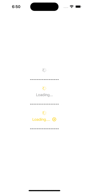
Simple ProgressView
struct ContentView:View
{
    var body: some View{

        VStack(spacing: 20){

            //Simple circuler progress view
            ProgressView()

       }
   }
}

ProgressView With Label
Let’s give the Progress view a label and tint
struct ContentView:View
{
    var body: some View{

        VStack(spacing: 20){

            //Simple circuler progress view
            ProgressView()

     /*       Text("-----------------")

            //progressView with label
            ProgressView("Loading...").tint(.yellow)
            Text("-----------------")

       }.padding()

    }

}
ProgressView with Label and Image
We can change the color of the label with the foregroundColor modifier. and images can also be added in the progressView.
struct ContentView:View
{
    var body: some View{

        VStack(spacing: 20){

            //Simple circuler progress view
            ProgressView()

            Text("-----------------")

            //progressView with label
            ProgressView("Loading...").tint(.yellow)
            Text("-----------------")

            //progressView with text and image
            ProgressView(){
                Text("Loading....").foregroundColor(.yellow)
                Image(systemName: "bolt.ring.closed").foregroundColor(.yellow)
            }.tint(.yellow)

            Text("-----------------")

         }.padding()

    }

}- tint: for changing the color of the
progressView. foregroundColor: for changing the color of the image and text
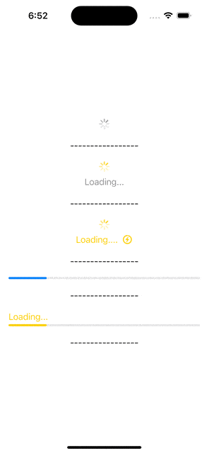
Change Style Of ProgressView
We can change the style of progressView by giving it value. When we give it a value parameter it changes its style from circular to linear. or you can also use the .progressViewStyle(.linear) modifier. This modifier will do the same work for us.
struct ContentView:View
{
    var body: some View{

        VStack(spacing: 20){

            //Simple circuler progress view
            ProgressView()

            Text("-----------------")

            //progressView with label
            ProgressView("Loading...").tint(.yellow)
            Text("-----------------")

            //progressView with text and image
            ProgressView(){
                Text("Loading....").foregroundColor(.yellow)
                Image(systemName: "bolt.ring.closed").foregroundColor(.yellow)
            }.tint(.yellow)

            Text("-----------------")


             //progress view of linear style
            ProgressView(value: 20, total: 100)

            Text("-----------------")


        }.padding()

    }

}
Change progressView color by using accentColor
struct ContentView:View
{
    var body: some View{

        VStack(spacing: 20){

            //Simple circuler progress view
            ProgressView()

            Text("-----------------")

            //progressView with label
            ProgressView("Loading...").tint(.yellow)
            Text("-----------------")

            //progressView with text and image
            ProgressView(){
                Text("Loading....").foregroundColor(.yellow)
                Image(systemName: "bolt.ring.closed").foregroundColor(.yellow)
            }.tint(.yellow)

            Text("-----------------")


            //progress view of linear style
            ProgressView(value: 20, total: 100)

            Text("-----------------")

            //change color of linear style progress view with accent color
            ProgressView(value: 20, total: 100){
                Text("Loading...").foregroundColor(.yellow)
            }
            .accentColor(.yellow)
            .progressViewStyle(.linear)

            Text("-----------------")


          //
        }.padding()

    }

}- accentColor: this will change the color of progressView. But it will only work on a linear style of progressView. for circular or default style we have to use a tint modifier for changing the color.
Leave a Reply