Customize ProgressView in SwiftUI
 By Samim
In this tutorial, we will see how to customize ProgressView in SwiftUI.
The ProgressView in SwiftUI is like a visual bar that shows how much something has finished or how much is left to complete. We might see it when something is loading, like a webpage or a game level.
When we customize a ProgressView, we make it match our app’s style or add more helpful details for users. We can change its color, shape, or add extra things to make it more useful or interesting for users.
Now, have a look at the different styles below.
Default Style
This will be a simple ProgressView with default settings and appearance.
Example
import SwiftUI
struct ContentView: View {
var body: some View {
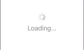
ProgressView()
}
}In the above program, the ProgressView() is used to create a simple progress view.
Output:

Change the size of the ProgressView
We can change the size of a ProgressView by using the scaleEffect() modifer which will scale the view by the specified factor.
Example
ProgressView()
    .scaleEffect(4.0)
In the above program, I have applied the scaleEffect() modifier to the ProgressView(), by scaling it with a factor of 4.0. This means the ProgressView will appear four times larger in both width and height.
Output:

We can also change the width and height separately, for that can use the scaleEffect with different X and Y factors to adjust each dimension independently.
Example
ProgressView()
    // Scale width by 4x and height by 3x
    .scaleEffect(x: 4.0, y: 3.0)
In the above code, the scaleEffect() modifier is applied with separate scaling factors of 4.0 for the X-axis (width) and 3.0 for the Y-axis (height).
This will scale the ProgressView to four times larger in width (horizontal scaling) and three times larger in height (vertical scaling) compared to its original size.
Output:

Change the size of the ProgressView Using the controlSize() modifier
We can use the controlSize() modifier to adjust the size of a ProgressView. This modifier provides some predefined sizes like mini, small, regular, and large, we can specify these to adjust the size.
This will only support in iOS 16 and the above version.
Example
VStack(spacing: 20) {
    ProgressView("mini")
        .controlSize(.mini)
    ProgressView("small")
        .controlSize(.small)
    ProgressView("regular")
        .controlSize(.regular)
    ProgressView("large")
        .controlSize(.large)
}
The above code will display four progress views with different size.
Output:

Change the color of the ProgressView
We can change the color of a ProgressView using the tint() modifier. This modifier takes color as the argument. So, we can specify our preferred color in this modifier to change.
Example
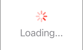
ProgressView()
    .scaleEffect(4.0)
    .tint(.red) //Change the color of the ProgressView to red
In the above code, I have applied the tint() modifier to the ProgressView specifying the color red. So, the ProgressView will appear in red.
Output:

Add label to the ProgressView
We can simply add label by specifying the label content inside the () closure of the ProgressView.
Example
ProgressView("Loading...")
    .scaleEffect(3.0)
    .tint(.red)
The above code will create a ProgressView with the label “Loading…“.
Output:
Change the color of the ProgressView label
We can also change the color of the label by applying the foregroundColor() modifier on the ProgressView, this modifier also takes color as the argument.
Example
ProgressView("Loading...")
    .foregroundColor(.mint) // To change the label color
    .scaleEffect(3.0)
    .tint(.red) // To change the ProgressView color
The above code will change the color of the label text to mint.
Output:

Circular Style
We can use the progressViewStyle() modifier on the progress view and pass the CircularProgressViewStyle() or .circular into this modifier to create a circular ProgressView in SwiftUI.
Example
ProgressView("Loading..." value: 0.5)
    .progressViewStyle(.circular)
    .scaleEffect(2.0)
In the above program, I have created a ProgressView with the label “Loading…” and a value of 0.5. The value parameter represents the operation’s current progress.
Then, the .progressViewStyle(.circular) modifier is applied to use the circular progress style.
Output:
As we can see in the above output, the ProgressView is as same as the default style, it is not circled.
This is because the circular progress style is only supported on macOS. For iOS, it appears as an indeterminate progress indicator.
Display the actual progress percentage
To dynamically display the actual progress percentage below the label within a circular ProgressView, we can use a @State variable to track the progress value.
Example
import SwiftUI

struct ContentView: View {
    // Define a state variable to track progress
    @State private var progressValue: Double = 0.5

    var body: some View {
        VStack {
            ProgressView("Loading...", value: progressValue)
                .progressViewStyle(.circular)

            // To display the calculated progress percentage based on the progressValue
            Text("\(Int(progressValue * 100))%")
        }
        .scaleEffect(3.0)
    }
}
The above code will create a ProgressView with the label “Loading…” and will dynamically update the percentage text based on the progressValue.
We can adjust the progressValue property to represent the actual progress in our application.
Output:

We can change the color of the ProgressView by using the .tint() modifier like as above.
We can also change the color of the ProgressView by putting the .tint() modifier inside the CircularProgressViewStyle() like below.
CircularProgressViewStyle(tint: .red)
This will change the ProgressView color to red.
Linear Style
We can create a linear ProgressView in SwiftUI by using the progressViewStyle() modifier and passing the LinearProgressViewStyle() or .linear into this modifier.
Example
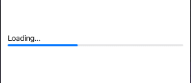
ProgressView("Loading...", value: 0.4)
    .progressViewStyle(LinearProgressViewStyle())
    .padding()
The above code will display a linear ProgressView with a horizontal bar that is 40% filled based on the progress value.
Output:
Change the size
We can change the size of a linear progress view using the scaleEffect() modifier.
Example
ProgressView("Loading...", value: 0.4)
    .progressViewStyle(LinearProgressViewStyle())
    .scaleEffect(x: 1, y: 5)
    .padding()
In the above code, I have used the scaleEffect() modifier with separate scaling factors of 1 for the X-axis (width) and 5 for the Y-axis (height).
This will scale the ProgressView to five times larger in height (vertical scaling) compared to its original size.
Output:

As we can see in the above output, the label of the ProgressView isn’t looking so good. So, we can prevent the label from scaling along with the ProgressView, by displaying the label separately.
Example
import SwiftUI

struct ContentView: View {
    var body: some View {
        VStack(alignment: .leading) {
            Text("Loading...:")
                .font(.title)
                .foregroundColor(.blue)

            ProgressView(value: 40, total: 100)
                .scaleEffect(x: 1, y: 5)
        }
        .padding()
    }
}
In the above program, I have used the Text view to separately display the label of the ProgressView.
Output:

Change the color of the ProgressView
In SwiftUI, to change the color of a linear ProgressView, we can use the .accentColor modifier.
Example
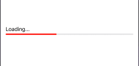
ProgressView("Loading...", value: 0.4)
    .progressViewStyle(LinearProgressViewStyle())
    //To change the color
    .accentColor(.red)
    .padding()
In the above code, the .accentColor(.red) will change the color of the progress bar within the ProgressView to red.
Output:
We can also change the color by using the tint() modifier instead of accentColor() modifier.
Display the progress percentage
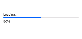
We can dynamically display the actual progress percentage below the label within a linear ProgressView by using a @State variable.
Example
import SwiftUI

struct ContentView: View {
    // Define a state variable to track progress
    @State private var progressValue: Double = 0.5

    var body: some View {
        VStack(alignment: .leading) {
            ProgressView("Loading...", value: progressValue)
                .progressViewStyle(LinearProgressViewStyle())

            // To display the calculated progress percentage based on the progressValue
            Text("\(Int(progressValue * 100))%")
        }
        .padding()
    }
}
Output:
Leave a Reply