Choropleth map with Folium in Python
 By Syeda Hina
In this tutorial, we will be looking into how to make Choropleth map with Folium in Python.
What is Choropleth Map?
Choropleth map is a map with different shades and colors. This map can have various symbols to indicate something specific. For example:

This map shows some random data for countries in Africa, Asia and the Middle East.
Interesting right?!
You may be thinking this gonna be very complex.
Wait, wait.
Again the python has come to the rescue. It already has an inbuilt library which is going to help us in building this map.
Let’s find out more about the library.
Folium Library
Yes, the Folium library helps us to build interactive maps to visualize our data easily.
First, you need to install the ‘Folium library’, which is readily available.
!pip install folium
Then, we will import the Folium library using the import function of Python.
Create Choropleth map with Folium
We will need to read our data, so we also import ‘Pandas’ library to read the data.
import folium
import pandas as pd
Now the game begins.
For the choropleth map we will need two types of input data:
- Geometric coordinates of a particular region, i.e., coordinates that describe different country or continent borders.
- This is GeoJSON file.
- If we don’t have such data we can use open-source data provided by Natural Earth project, i.e., GeoJSON.
- Data that we want to display on the map, like population density of various countries, employment rates of various states in India, etc.
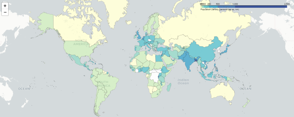
Now we will build a choropleth map for the Population density of the world for the year 2023.
Also read: Map Visualization with Folium in Python
Let’s load the data
#Data 1
countries_url = (
    "http://geojson.xyz/naturalearth-3.3.0/ne_50m_admin_0_countries.geojson"
)

#Data 2
population_all = pd.read_csv("population density 2023.csv")
Here, I have downloaded the population density data from this Wikipedia.
Once we have loaded the data, we will first define a plain map, as shown below.
m = folium.Map(location=(20, 0), zoom_start = 2, tiles='CartoDB Positron')
Here, I have set the location to 20, 0. You can set it at your convenience.
Similarly, I have set the zoom level as 2. The ‘tiles‘ variable is used to select various types of map styles like
- OpenStreetMap
- Mapbox Bright
- Mapbox Control Room
- Stamen (incl. Terrain, Toner, and Watercolor)
- Cloudmade
- Mapbox
- CartoDB (incl. positron and dark_matter)
Dataset that I have used population density 2023.csv (From wikipedia)
Create Choropleth Map
The next step is to add the choropleth to the already created map. The code for it is as shown below:
folium.Choropleth(
    geo_data=countries_url,
    data=population_density,
    columns=["Country", "Density"],
    key_on="feature.properties.name",
    fill_color='YlGnBu',  # color scale
    legend_name='Population Density (persons per sq. km)'
).add_to(m)
Here,
geo_data is the geospatial data, i.e., data 1.
data is our data, in this example, I have taken the population density of the world.
columns will have the country name and population density which is already present in our data. Note: Make sure the population density is numeric in nature.
key_on will create a link between both the data based on the country column.
fill_color specifies what color shades you want to use in the map, I have used shades of Yellow, Blue and green.
legend_name is the bar on top of the map which shows the connection between colors and values on the map.
All these data we are adding to the already created map with the help of ‘add_to(m)‘ code.
With this, our map is created.
To view the map, we can either save it as html file or load it in the interpreter itself. Let’s see both.
#to save the map
m.save('choropleth_map.html')

#to display in interpreter or jupyter notebook itself
m
Output:
Leave a Reply