Change the TextField style after tapping on it in SwiftUI
 By Samim
In this tutorial, we will see how to change the TextField style after tapping on it in SwiftUI.
In SwiftUI, we can change the style of a TextField after tapping on it by using the onTapGesture modifier in combination with a @State variable to track whether the text field is active or not.
Now, have a look at the different styles below.
Change the background color
We can modify the background color of the TextField after clicking on it by updating its background color within the onTapGesture action.
import SwiftUI

struct ContentView: View {
    //To hold the text entered in the TextField
    @State private var text: String = ""

    //To track whether the TextField is being edited or not
    @State private var isEditing: Bool = false

    //To control the background color of the TextField
    @State private var backgroundColor: Color = Color.white

    var body: some View {
        TextField("Enter text", text: $text)
            .padding()
            // Set the background color of the TextField
            .background(backgroundColor)
            .padding()

            // Add a tap gesture to handle when the TextField is tapped
            .onTapGesture {
                // Update the isEditing state variable to true
                isEditing = true
                // Change the background color to yellow when tapped
                backgroundColor = Color.yellow
            }
    }
}
The above program will create a TextField that will hold user-entered text in the text state variable and tracks whether it is being edited with the isEditing boolean.
The backgroundColor state variable will control the background color, which is initially set to white and it will change the background color to yellow when we tap the TextField due to the .onTapGesture action.
Output:

Add animation
We can also animate the change in color when we tap the TextField by embedding the backgroundColor = Color.yellow in the withAnimation block.
Example
import SwiftUI

struct ContentView: View {
    @State private var text: String = ""
    @State private var isEditing: Bool = false
    @State private var backgroundColor: Color = Color.white

    var body: some View {
        TextField("Enter text", text: $text)
            .padding()
            .background(backgroundColor)
            .padding()

            .onTapGesture {
                isEditing = true
                // To animate the change in color when tapped
                withAnimation {
                    backgroundColor = Color.yellow
                }
            }
    }
}
In the above program, I have put the change of backgroundColor inside the withAnimation block to animate the change in color when the TextField is tapped.
We can customize the animation speed or style by adjusting parameters within the withAnimation block as per our requirements.
Output:

Change the border color
In SwiftUI, we can change the border color of a TextField after tapping on it by using a combination of @State and the onTapGesture modifier.
Example
import SwiftUI

struct ContentView: View {
    @State private var text: String = ""
    //To track whether the TextField is being edited or not
    @State private var isEditing: Bool = false

    var body: some View {
        TextField("Enter text", text: $text)
            .padding()
            //To add a border around the TextField. The border colour will be blue if isEditing is true; else, it will be grey.
            .border(isEditing ? Color.blue : Color.gray, width: 2)
            .padding()
            .onTapGesture {
                // when the TextField is tapped, setting isEditing to true to indicate editing
                self.isEditing = true
            }
    }
}
In the above program, I have created a @State property called isEditing to track if the TextField is currently being edited.
The .border() modifier will create a border around the TextField, and change the border color based on the isEditing state variable.
Then, I have applied the onTapGesture modifier to the TextField, so when we tap on the TextField it will set the isEditing state variable to true, and the border color will change to blue, as specified in the .border() modifier.
Output:

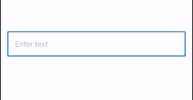
Change the border to a rounded rectangle on tap
We can also change the border of a TextField to a rounded rectangle when tapped. We can use the onTapGesture modifier to detect when a TextField is tapped, and then modify the border by changing the TextField background using a RoundedRectangle with a stroke.
Example
import SwiftUI

struct ContentView: View {
    @State private var text: String = ""
    @State private var isEditing: Bool = false

    var body: some View {
        TextField("Enter text", text: $text)
            .padding()
            .background(
                //Corner radius depending on the value of the isEditing boolean state property
                RoundedRectangle(cornerRadius: isEditing ? 20 : 0)
                    .stroke(Color.blue, lineWidth: 2)
            )
            .padding()
            .onTapGesture {
                isEditing = true
            }
    }
}
The above code will create a TextField that has a blue border which changes its corner radius when we tap on it.
When we tap the TextField, it will set the isEditing variable to true, and the corner radius of the background changes to either 20 or 0 based on that variable.
Output:
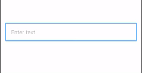
Animate the change
Now, if we wish to add animation while it is rounding the corners when we tap the TextField, we can animate the rounding of corners when we tap the TextField by embedding the isEditing = true in the withAnimation block.
Example
import SwiftUI

struct ContentView: View {
    @State private var text: String = ""
    @State private var isEditing: Bool = false

    var body: some View {
        TextField("Enter text", text: $text)
            .padding()
            .background(
                //Corner radius depending on the value of the isEditing boolean state property
                RoundedRectangle(cornerRadius: isEditing ? 20 : 0)
                    .stroke(Color.blue, lineWidth: 2)
            )
            .padding()
            .onTapGesture {
                // To animate the rounding of corners when we tap the TextField
                withAnimation {
                    isEditing = true
                }
            }
    }
}
The above code will create a TextField, when we tap the TextField the withAnimation block will be triggered and the border around the TextField smoothly transitions from having square corners to rounded corners.
Output:
Change the height and width of the TextField
We can adjust the height and width of the TextField when it is tapped by changing its frame within the onTapGesture.
Now, have a look at the example below.
import SwiftUI

struct ContentView: View {
    @State private var text: String = ""
    @State private var isEditing: Bool = false
    @State private var textFieldWidth: CGFloat = 250 // Initial width
    @State private var textFieldHeight: CGFloat = 50 // Initial height

    var body: some View {
        TextField("Enter text", text: $text)
             // Set the initial dimensions of the text field
            .frame(width: textFieldWidth, height: textFieldHeight)
            .padding()
            .background(
                RoundedRectangle(cornerRadius: 20)
                    .stroke(Color.blue, lineWidth: 2)
            )
            .padding()
            .onTapGesture {
                // Perform the following block of code with animation
                withAnimation {
                    // Update the editing state to true
                    isEditing = true
                    // Update the dimensions of the text field based on the editing state
                    textFieldWidth = isEditing ? 300 : 250
                    textFieldHeight = isEditing ? 70 : 50
                }
            }
    }
}
In the above program, I have declared the textFieldWidth and textFieldHeight properties to store the initial dimensions of the TextField.
The .frame() modifier is used to set the initial size of the TextField based on the textFieldWidth and textFieldHeight state variables.
Then, the textFieldWidth and textFieldHeight are updated conditionally based on the isEditing state. If isEditing is true, the width becomes 300 and the height becomes 70, otherwise, it will remain unchanged.
So, the above SwiftUI code will create a TextField that will grow in size with an animation when we tap the TextField.
Output:

Leave a Reply