Bivariate Analysis in Python
 By Yathartha Rana
In the data science field, when you get the data, the first step that is performed is exploratory data analysis. So, in this tutorial, we will explore the concept of bivariate analysis.
Bivariate Analysis
As the name suggests, bivariate means two variables. Therefore, we can say that the analysis is performed on two variables. Now, the question is, what do we aim for from this analysis? The goal is to determine the relation between the two variables. A variable is of two types: Continuous and Categorical.
A continuous variable is quantitative, whereas a categorical variable is qualitative.
Continuous and Continuous Variables
For this analysis, we use a scatter plot for visualization and calculate the correlation coefficient to understand the relationship between the two variables. I am using the iris dataset for bivariate analysis. As we must select quantitative values, I have selected the Sepal Length and Sepal Width columns.
import seaborn as sns
import matplotlib.pyplot as plt
import pandas as pd
from sklearn.datasets import load_iris

# Load Iris dataset
iris = load_iris()
df = pd.DataFrame(iris.data, columns=iris.feature_names)
df['species'] = pd.Categorical.from_codes(iris.target, iris.target_names)


# Let's compare sepal length and sepal width for continuous continuous variable type
plt.figure(figsize=(10, 6))
sns.scatterplot(x='sepal length (cm)', y='sepal width (cm)', hue='species', style='species', data=df)
plt.title('Scatter Plot of Sepal Length vs. Sepal Width by Species')
plt.xlabel('Sepal Length (cm)')
plt.ylabel('Sepal Width (cm)')
plt.show()


# Calculate and display the correlation coefficient between sepal length and sepal width
correlation_matrix = df[['sepal length (cm)', 'sepal width (cm)']].corr()
print("Correlation coefficient between Sepal Length and Sepal Width:\n", correlation_matrix)
Output

Correlation coefficient between Sepal Length and Sepal Width:
                    sepal length (cm)     sepal width (cm)
sepal length (cm)   1.00000               -0.11757
sepal width (cm)    -0.11757              1.00000
Explanation
If you don’t know about the correlation matrix, which contains the correlation coefficients, refer to this article: Correlation matrix.
Continuous and Categorical Variables
For this analysis, we use box plots or violin plots for visualization. If we want to determine the relationship mathematically, then ANOVA (Analysis of Variance) is used, which tells the differences between the mean of continuous variables across categories. I am again using the iris dataset, and for the continuous variable, I have used the Petal Length column, and for the Categorical variable, I have used the Species column.
import seaborn as sns
import matplotlib.pyplot as plt
import pandas as pd
from scipy import stats
from sklearn.datasets import load_iris

# Load Iris dataset
iris = load_iris()
df = pd.DataFrame(iris.data, columns=iris.feature_names)
df['species'] = pd.Categorical.from_codes(iris.target, iris.target_names)

# Box Plot
plt.figure(figsize=(10, 6))
sns.boxplot(x='species', y='petal length (cm)', data=df)
plt.title('Petal Length Distribution by Species')
plt.show()

# ANOVA
f_value, p_value = stats.f_oneway(df[df['species'] == 'setosa']['petal length (cm)'],
                                  df[df['species'] == 'versicolor']['petal length (cm)'],
                                  df[df['species'] == 'virginica']['petal length (cm)'])
print(f"ANOVA test results - F value: {f_value}, P value: {p_value}")
Output
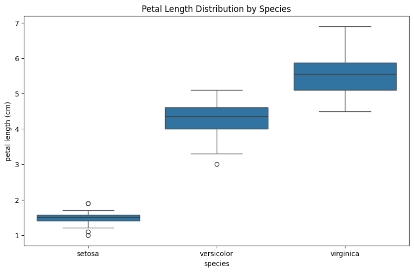
ANOVA test results - F value: 1180.161182252981, P value: 2.8567766109615584e-91
Explanation
The ANOVA tests the null hypothesis that all groups have the same mean against the alternative hypothesis that at least one group differs.
The F value is the ratio of variance between the groups to variance within the groups. A large F-value may indicate a significant effect of the independent variable on the dependent variable. Therefore, it assesses whether the overall variance in the dependent variables is due to the independent variables.
The P value indicates the probability of the null hypothesis being true. Therefore, it tells whether the F value is significant or not. A smaller p-value (<0.05) rejects the null hypothesis.
Categorical and Categorical variables
For this analysis, we use heat maps for visualization, made on a contingency table. If we want to determine the relationship mathematically, then Chi-squared test is used. A contingency table contains the frequency distribution of variables across cases.
import pandas as pd
import seaborn as sns
import matplotlib.pyplot as plt
from scipy.stats import chi2_contingency


data = {'Gender': ['Male', 'Female', 'Male', 'Female', 'Male', 'Female'],
        'Preference': ['Tea', 'Coffee', 'Tea', 'Tea', 'Coffee', 'Coffee']}
df = pd.DataFrame(data)


contingency_table = pd.crosstab(df['Gender'], df['Preference'])

# Chi-squared test
chi2, p, dof, expected = chi2_contingency(contingency_table)
print(f"Chi-squared test results - Chi2 value: {chi2}, P value: {p}")

# Heatmap
plt.figure(figsize=(8, 6))
sns.heatmap(contingency_table, annot=True, cmap="YlGnBu", fmt="d")
plt.title('Heatmap of Gender vs. Preference')
plt.ylabel('Gender')
plt.xlabel('Preference')
plt.show()
Output

Chi-squared test results - Chi2 value: 0.0, P value: 1.0
Explanation
Chi-squared test is used to determine the relationship between the two categorical values. It examines whether the observed distribution of cases across categorical variables deviates from expectation or not. If it deviates, then how much deviate and whether this deviation is likely to occur due to by-chance or not.
The Χ2 value measures the difference between the observed frequencies from the contingency table to expected frequencies ( frequency if there were no relation between two categorical variables). A higher value indicates a stronger relation between the two variables.
The P value indicates the probability of the null hypothesis ( no relation between the variables) being true. Therefore, it tells whether the Χ2 is significant or not. A smaller p-value (<0.05) rejects the null hypothesis, which indicates that the relation between the variables exists and the difference does not occur by chance.
Leave a Reply