Handle Noise in Dataset using Various Methods in Python
 By Isha Bansal
In this tutorial, we will learn how to remove and handle noise in the dataset using various methods in Python programming.
Let’s first create a dataset and visualize the noise in real time to understand our aim a little better. We will create a set of data points (using numpy), we will consider the graph of the sine wave. Next, we will create a set of random data points that will contribute as Noise to the final signal. Then we will create the final signal by adding both data and noise together.
import numpy as np

DATA = np.sin(np.linspace(0, 2*np.pi, 100))
NOISE = 0.5 * np.random.normal(size=100)
FINAL = DATA + NOISE
Let’s look at how the noise looks in the actual signal using the code snippet below. In the plot, we will be plotting both DATA and NOISE in one single plot where NOISE is plotted in RED and normal signal is plotted in GREEN.
import matplotlib.pyplot as plt
plt.plot(DATA, label='No Noisy Signal', color='green')
plt.plot(FINAL, label='Noisy Signal', color='red')
plt.xlabel('Time')
plt.ylabel('Amplitude')
plt.title('Noisy Sine Wave Visualization')
plt.legend()
plt.show()
The resulting plot is shown below.

Now you can see how the noise is ruining the original smooth plot. Let’s try to change that using two different methods: Smoothning and Filtering.
Method 1 – Smoothning Techniques To Handle Noise
This approach will cover the below Smoothning techniques:
- Moving Average
- Exponential Moving Average (EMA)
Approach 1 – Moving Average
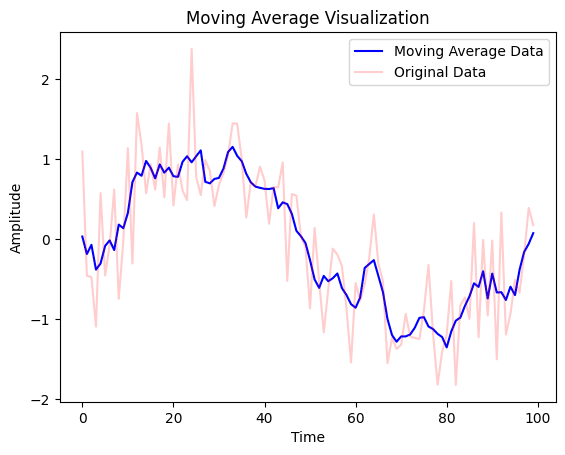
A moving average is one of the simplest techniques where we would replace the noise with the average of the values and their neighboring values (window_size). It calculates the average of a window of data points and replaces the center point with this average. This method aims to smooth out the fluctuations in the dataset. Have a look at the code implementation for this method below.
def movingAvg (data, window_size):
  window = np.ones(window_size) / window_size
  return np.convolve(data, window, mode='same')

movingAvg_DATA = movingAvg(FINAL,5)

plt.plot(movingAvg_DATA, label='Moving Average Data', color='blue')
plt.plot(FINAL, label='Original Data', color='red',alpha = 0.2)
plt.xlabel('Time')
plt.ylabel('Amplitude')
plt.title('Moving Average Visualization')
plt.legend()
plt.show()
This method is straightforward. It involves taking the average of neighboring data points within a specified window size. The size of the window determines the level of smoothing. The output plot that gets displayed on the screen is as follows:
Approach 2 – Exponential Moving Average (EMA)
The exponential moving average is a variation of the moving average that places more weight on recent observations, making it more responsive to changes/real-time data. It calculates the weighted average of all past observations, with the weights decreasing exponentially.
def EMA(data, alpha):
    ema = [data[0]]
    for i in range(1, len(data)):
        ema.append(alpha * data[i] + (1 - alpha) * ema[i-1])
    return np.array(ema)

EMA_DATA = EMA(FINAL,0.2)

plt.plot(EMA_DATA, label='Exponential Moving Average Data', color='blue')
plt.plot(FINAL, label='Original Data', color='red',alpha = 0.2)
plt.xlabel('Time')
plt.ylabel('Amplitude')
plt.title('Exponential Moving Average (EMA) Visualization')
plt.legend()
plt.show()
The output plot that gets displayed on the screen is as follows:

Moving Average V/S Exponential Moving Average (EMA)
Let’s visualize the results from both the smoothing techniques in a single plot using the code snippet below.
plt.plot(EMA_DATA, label='Exponential Moving Average Data', color='blue',alpha=0.4)
plt.plot(movingAvg_DATA, label='Moving Average Data', color='green',alpha=0.2)
plt.xlabel('Time')
plt.ylabel('Amplitude')
plt.title('Moving Average V/S Exponential Moving Average (EMA) Visualization')
plt.legend()
plt.show()
The output plot that gets displayed on the screen is as follows:

Method 2 – Filtering Techniques To Handle Noise
This approach will cover the below filtering techniques:
- Low Pass Filter
- Savitzkey Golay Filter
Approach 1 – Low Pass Filter
A low pass filter is a type of filter that allows signals with a frequency lower than a certain cutoff frequency to pass through and reduces the value of the higher frequency signals to pass through. In other words, it removes high-frequency noise from a signal while preserving the lower-frequency signals.
For code implementation of the Low pass filter, we will make use of the butter and filtfilt functions under signal library. Here in the code, the order specifies the number of poles in the filter, while the cutoff frequency specifies the frequency at which the filter lets the signal pass through.
from scipy.signal import butter, filtfilt

def lowPassFilter(data, order, cutoff_freq):
    nyquist_freq = 0.5
    normal_cutoff = cutoff_freq / nyquist_freq
    b, a = butter(order, normal_cutoff, btype='low', analog=False)
    y = filtfilt(b, a, data)
    return y

lowPassFilter_DATA = lowPassFilter(FINAL, 2, 0.1)

plt.plot(lowPassFilter_DATA, label='Low Pass Filter Data', color='blue')
plt.plot(FINAL, label='Original Data', color='red',alpha = 0.2)
plt.xlabel('Time')
plt.ylabel('Amplitude')
plt.title('Low Pass Filter Visualization')
plt.legend()
plt.show()
The problem with this method is that the choice of cutoff frequency can be a critical decision in this method and may require some trial and error method before finalizing a value for the cutoff. The output plot that gets displayed on the screen is as follows:

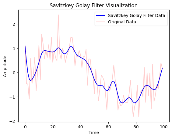
Approach 2 – Savitzky-Golay Filter
Savitzky-Golay Filter is similar to Low Pass filter but it aims to smoothen the curve using a set of polynomials with the help of a sliding window of fixed size. To implement the Savitzky-Golay Filter, we will directly use savgol_filter function from scipy.signal as shown in the code snippet below.
from scipy.signal import savgol_filter

savgolFilter_DATA = lowPassFilter(FINAL, 2, 0.1)

plt.plot(savgolFilter_DATA, label='Savitzkey Golay Filter Data', color='blue')
plt.plot(FINAL, label='Original Data', color='red',alpha = 0.2)
plt.xlabel('Time')
plt.ylabel('Amplitude')
plt.title('Savitzkey Golay Filter Visualization')
plt.legend()
plt.show()
The output plot that gets displayed on the screen is as follows:
Plotting all the Methods Together
We will use the power of subplots as shown in the code snippet below to display all the visualizations together for more understanding.
fig, axs = plt.subplots(3, 2,figsize=(10,5))

axs[0, 0].plot(DATA, color='red')
axs[0, 0].set_xlabel('Time',fontsize=7)
axs[0, 0].set_ylabel('Amplitude',fontsize=7)
axs[0, 0].set_title('Original Sine Wave Data Visualization',fontsize=7)


axs[0, 1].plot(FINAL, color='yellow')
axs[0, 1].set_xlabel('Time',fontsize=7)
axs[0, 1].set_ylabel('Amplitude',fontsize=7)
axs[0, 1].set_title('Noisy Sine Wave Visualization',fontsize=7)

axs[1, 0].plot(movingAvg_DATA, color='green')
axs[1, 0].set_xlabel('Time',fontsize=7)
axs[1, 0].set_ylabel('Amplitude',fontsize=7)
axs[1, 0].set_title('Moving Average Visualization',fontsize=7)

axs[1, 1].plot(EMA_DATA, color='magenta')
axs[1, 1].set_xlabel('Time',fontsize=7)
axs[1, 1].set_ylabel('Amplitude',fontsize=7)
axs[1, 1].set_title('Exponential Moving Average (EMA) Visualization',fontsize=7)

axs[2, 0].plot(lowPassFilter_DATA, color='purple')
axs[2, 0].set_xlabel('Time',fontsize=7)
axs[2, 0].set_ylabel('Amplitude',fontsize=7)
axs[2, 0].set_title('Low Pass Filter Visualization',fontsize=7)

axs[2, 1].plot(savgolFilter_DATA, color='skyblue')
axs[2, 1].set_xlabel('Time',fontsize=7)
axs[2, 1].set_ylabel('Amplitude',fontsize=7)
axs[2, 1].set_title('Savitzkey Golay Filter Visualization',fontsize=7)

plt.suptitle("Visualization of Handling Noise in Dataset using Various Methods")
plt.tight_layout()
plt.show()
The output plot that gets displayed on the screen is as follows:

I hope you learned something new through this tutorial.
Also Read:
- Calculate Signal to Noise ratio in Python
- Detect and Handle Outliers using Various Methods in Python
- Handle Missing Values using Various Methods in Python
Happy Learning!
Leave a Reply