How to Plot Line of Best Fit in Python
 By Isha Bansal
Hello fellow Python coder! Today, in this tutorial we’ll be learning about plotting a line of Best Fit in Python. If you are confused about what a Best Fit line is, the same will be explained in the upcoming sections.
So before any delay, let’s get right on with it!
Introduction to Line of Best Fit
To understand the concept of Line of Best Fit, let’s take an example of the night sky above us. We know that there are a lot of stars spread across the vast sky above our heads. Consider these stars as data points the space of our graphs each having a pair of x and y coordinates.
You can compare the Line of Best Fit with a constellation. How? We know that a constellation is formed with the help of finding the patterns of the stars nearby and can help you visualize the hidden patterns that exist in how the stars are positioned.
The Line of Best Fit does the same but for the data points in a graph, it is constructed using the patterns and characteristics of the data points present in the space. It helps discover hidden patterns present in these data points as well.
Implementing Line of Best Fit using Python
For this tutorial, let’s take the example of No. of hours a student has studied v/s exam scores achieved by the student against it. Before Best Fit Line, we will start by creating a dataset using the data below.
Data Creation
For the creation of data, we will make use of numpy library and the functions present inside the library. To get values under a certain range and random step we will make use of the uniform function. Also for our simplicity, we will be rounding off the values using the round function. Have a look at the code below:
import numpy as np
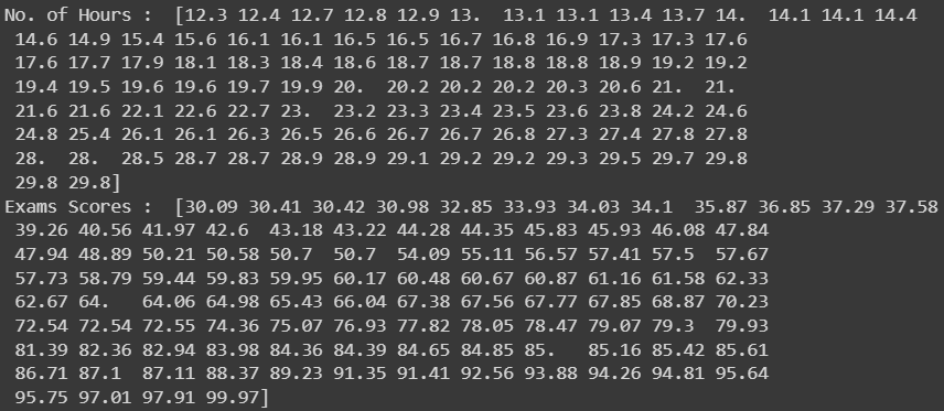
noHoursStudied = np.sort(np.round(np.random.uniform(12, 30, 100), 1))
examScoresGained = np.sort(np.round(np.random.uniform(30, 100, 100), 2))
print("No. of Hours : ", noHoursStudied)
print("Exams Scores : ",examScoresGained)
The code mentioned above is self-explanatory and will result in similar data as shown in the image below:
Data Visualization
Now that we have the data with us, let’s plot the data using the scatter plot under the matplotlib library using the code snippet below. If you are unaware of scatter plots you can go through the tutorial mentioned below as well.
Also Read: Matplotlib scatter plot in Python
import matplotlib.pyplot as plt

plt.style.use('seaborn')
plt.figure(figsize=(5,5))

plt.scatter(noHoursStudied, examScoresGained, color='green')
plt.xlabel('No. of Hours Studied by the Student')
plt.ylabel('Scores gained in Exam by the Student')
plt.title('Scatter Plot of No. of Hours Studied vs Scores gained in Exam by the Student')

plt.show()
We will be styling the plot by using the seaborn theme to make the plot look pretty and also set the figsize according to our preference. You can change the same according to your liking. The resulting plot looks similar to shown below:

Your plot might be different if you used a different set of initial datasets.
Plotting Line of Best Fit
Now the next step involves getting the Line of Best fit which implies a line that will be able to pass through a maximum of the points and also will be able to identify the hidden patterns or common features within the points I have mentioned.
To achieve the same, we will make use of the polyfit and ployval functions. Let’s know more about them one by one. The function of polyfit function is to take two different variables (in our case they are noHoursStudied and examScoresGained) and give us coefficients of the line to be plotted.
When it comes to plotting a line the general equation is: y = a + bx where a and b are the intercept and slope respectively (that’s just basic linear algebra). So in this case a and b are known as coefficients. For our case, our x and y are noHoursStudied and examScoresGained respectively.

polyfit Function
So let’s make use of polyfit function to get coefficients of the straight line using the code below:
coefficients = np.polyfit(noHoursStudied, examScoresGained, 1)
slope, intercept = coefficients

print("The resulting equation is : y = ",intercept," + ",slope,"x")
The variable coefficients takes both the slope and intercept which we will unpack in the next line. We will also print the equation of the line using the print statement. The result of the code execution is shown below:
The resulting equation is : y = -25.874420483006524 + 4.239954967053389 x
polyval Function
Let’s move on to the functionality of the polyval function which helps to get the straight line data points to plot the line later into the plot. The function will take help of the coefficients and the no of hours to get resulting scores of exams.
line_of_best_fit = np.polyval(coefficients, noHoursStudied)
print("Line of Best Fit is : ", line_of_best_fit)
The screen displays the resulting data points for the best fit line as shown below.

Final Visualization of Line of Best Fit
Finally, we will plot all the data points along with line of best fit in a single plot using the code snippet below:
plt.scatter(noHoursStudied, examScoresGained, color='green')
plt.plot(noHoursStudied, line_of_best_fit, color='blue')
plt.xlabel('No. of Hours Studied by the Student')
plt.ylabel('Scores gained in Exam by the Student')
plt.title('LINE OF BEST FIT for No. of Hours Studied vs Scores gained in Exam by the Student')
plt.show()
The screen displays the resulting plot as shown below.

I hope you learned something new through this tutorial.
Also Read:
How to Add an Average Line to Plot in Matplotlib
Happy Learning!
Leave a Reply