Add alert on some user action in Material UI
 By Asif
In this tutorial, we are learning about <Alert> component of material UI. Alert, as we see in almost every interactive website, is a way of giving the user feedback on completing a certain task, without interrupting the user’s task. For example, “ⓘ Did you understand?” …haha. Let’s learn with real use cases.
Topics Covered:
- Alert Component
- Customization – Icon, Description, Variants, Color
- Actions
- Alert and Snackbar
Alert Component – Basics
To use the alert component, we will have to first add mui as a dependency in the project through npm install @mui/material command and import it from the library:
import { Alert } from "@mui/material";
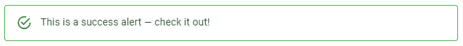
Alert offers four severity levels with four different icons and colors.
<Alert severity="success">This is a success alert!</Alert>
<Alert severity="info">This is an info alert!</Alert>
<Alert severity="error">This is an error alert!</Alert>
<Alert severity="warning">This is a warning alert!</Alert>
Output:

Customization – Icon, Description, Color, Variant
Now comes the best part. You can customize your alerts according to the need of your message. That can be done using different props inside the Alert tag. Here’s a diagram showing which part of the alert represents what:
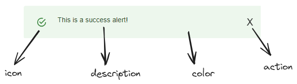
icon
Using the icon prop, you can change the default icon in the alert or remove it according to your needs. You can choose any from the vast material icons collection and simply import to use them. Don’t forget to add a dependency to your project or use a CDN link. Later we will understand with a beautiful example.
description (title)
You can add a description, or in the right sense, add a title to your alert message. Simply import the <AlertTitle/> component from “@mui/material” and use it inside <Alert/> component.
color
Change the default color of the alert using the color prop.
variant
The variant prop lets you choose between two variants of alert, other than the default. They are ‘outlined’ and ‘filled’:

Filled can be used when it’s necessary to grab a user’s attention. In contrast, when the alert is not so important for the user to continue his further interaction, the Outlined variant can be used.
Let us understand all this functioning together with their syntax through a lively example:
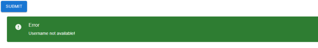
There’s a submit button, which sends a success alert to the user on successful submission. Whereas, in this scenario, it displays the message to the user that the filled username has been used by other users. And weirdly, the error needs to be shown in the green color here! (This is done just to show all props of alert in action, standard practices should be followed in real world)
Below is the code, focus on the alert component to learn the syntax of different props. Other than that, a state variable, ‘show’ is used. Collapse component is used to add some smooth transition while showing the alert.
import { Alert, AlertTitle, Button, Collapse } from "@mui/material";
import ErrorIcon from "@mui/icons-material/Error";
import { useState } from "react";

function App() {
  const [show, setShow] = useState(false);

  return (
    <>
      <Button variant="contained" onClick={() => setShow(true)}>
        Submit
      </Button>
      <Collapse in={show}> {/* Collapse component from mui, adds a transition effect */}
        <Alert icon={<ErrorIcon />} severity="error" color="success" variant="filled">
          <AlertTitle>Error</AlertTitle>
          Username not available!
        </Alert>
      </Collapse>
    </>
  );
}

export default App;
Output:
Actions – Material UI Alert
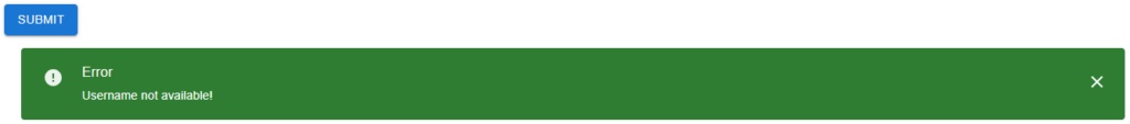
An alert can have an action, such as a close or undo button. It is rendered after the message, at the end of the alert. It can also serve other purposes like redirecting the user to a certain link etc.
If an onClose callback is provided and no action prop is set, a close icon is displayed. The action prop can be used to provide an alternative action, for example using a Button or IconButton. action prop takes a jsx component as value.
In our example, we could see that the message could not be hidden, once it appears. action prop can solve this, letting us pass a functional button as the prop. It is passed inside curly braces as we are writing jsx inside the prop. Run the code in your local setup to understand it properly.
import { Alert, AlertTitle, Button, Collapse, IconButton } from "@mui/material";
import ErrorIcon from "@mui/icons-material/Error";
import CloseIcon from "@mui/icons-material/Close";
import { useState } from "react";

function App() {
  const [show, setShow] = useState(false);

  return (
    <>
      <Button variant="contained" onClick={() => setShow(true)}>
        Submit
      </Button>
      <Collapse in={show}>
        <Alert
          icon={<ErrorIcon />}
          severity="error"
          color="success"
          variant="filled"
          action={
            <IconButton color="inherit" onClick={() => setShow(false)}>
              <CloseIcon />
            </IconButton>
          }
        >
          <AlertTitle>Error</AlertTitle>
          Username not available!
        </Alert>
      </Collapse>
    </>
  );
}

export default App;
Output:
Snackbar – Material UI
Snackbar provides brief notifications. The component is also called as toast. Though they almost serve the same as the alert, they differ from alert in the following ways:
-They appear temporarily, at the bottom of the window. They shouldn’t interrupt the user experience, and they can disappear without any user action. There’s an autoHideDuration prop for that.
-They may contain a text action to show notification.
We’ll discuss them in another blog.
Summary
So, in this blog, we learned about the alert component, and how we can customize it with different props, learned with an example and understood action prop of the component. We also learned the difference between snackbar and alert.
We’ll meet again in another tutorial, till then ba-bye.
Leave a Reply