Menu in SwiftUI
 By Samim
In this tutorial, we will see how to create a Menu in SwiftUI.
A menu is similar to a list of options we see in apps or websites. It can be a dropdown list that appears when we click on something, a set of choices that pop up when we right-click, or even a bar with buttons that display more options.
So, In SwiftUI, menus are used to display a list of actions or options to users.
Now, have a look at the different types of menus below.
Dropdown Menu
A dropdown menu is a menu that displays a list of options when we click or interact with a specific element, like a button or icon. We can easily create a simple dropdown menu using the Menu view.
Example
import SwiftUI

struct ContentView: View {
    var body: some View {
        VStack {
            Menu {
                Button("Option 1") {
                    // Action when Option 1 is tapped
                    // You can add code here to handle Option 1 selection
                }
                Button("Option 2") {
                    // Action when Option 1 is tapped
                    // You can add code here to handle Option 1 selection
                }
                Button("Option 3") {
                    // Action when Option 1 is tapped
                    // You can add code here to handle Option 1 selection
                }
            } label: {
                Label("MENU", systemImage: "list.bullet")
                    .padding()
            }


        }
    }
}
Output:

Context Menu
The context menu also shows a list of options like a dropdown list, but in the case of the context menu, we have to long-press the element to display the options.
We can create a context menu using the contextMenu modifier.
Example
import SwiftUI

struct ContentView: View {
    var body: some View {
        Text("MENU")
            .contextMenu {
                Button("Option 1") {
                    // Perform action
                }
                Button("Option 2") {
                    // Perform action
                }
                Button("Option 3") {
                    // Perform action
                }
            }
    }
}
Output:

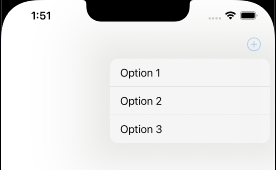
Using the Toolbar
The toolbar is an app’s view that contains a set of controls or buttons for users to execute actions. It is usually located at the top or bottom of the screen and allows quick access to popular functions or tasks.
We can create a toolbar using the toolbar modifier. We can use the Menu within the toolbar modifier to display a list of options.
Example
import SwiftUI

struct ContentView: View {
    var body: some View {
        NavigationView {
            Text("Hello SwiftUI")
                .toolbar {
                    ToolbarItem(placement: .navigationBarTrailing) {
                        Menu {
                            Button("Option 1") {

                            }
                            Button("Option 2") {

                            }
                            Button("Option 3") {

                            }
                        } label: {
                            Label("Menu", systemImage: "plus.circle")
                        }

                    }
                }
        }
    }
}
Output:
Nested menu
A nested menu is a menu structure where one menu is inside another. So, when we select a particular option in the main menu, the submenu will appear with more choices or actions.
We can create a nested menu by embedding one Menu view inside another Menu.
Example
import SwiftUI

struct ContentView: View {
    var body: some View {
        VStack {
            // Main Menu
            Menu {
                // Options in the main menu
                Button("Option 1") {
                    // Action for Option 1
                }
                Button("Option 2") {
                    // Action for Option 2
                }

                // Nested Menu
                Menu {
                    // Options in the nested menu
                    Button("Nested Option 1") {
                        // Action for Nested Option 1
                    }
                    Button("Nested Option 2") {
                        // Action for Nested Option 2
                    }
                } label: {
                    // Label for the nested menu
                    Label("Nested Options", systemImage: "arrow.right.circle")
                }
            } label: {
                // Label for the main menu
                Label("MENU", systemImage: "list.bullet")
                    .padding()
            }
            Text("Open menu")
        }
    }
}
Output:


Add icon to menu options
We can use the label parameter of the Button view to combine an image and text to add icons to the menu items in SwiftUI.
Have a look at the example below to do that.
Button(action: {
    // Button action goes here
}) {
    Label("Option 1", systemImage: "square.and.pencil")
}
I will use SF Symbol as the icons for the Menu options.
Here is the complete code below.
import SwiftUI

struct ContentView: View {
    var body: some View {
        VStack {
            // Button with a menu
            Menu {
                Button(action: {
                    // Button action goes here
                }) {
                    Label("Option 1", systemImage: "square.and.pencil")
                }

                Button(action: {
                    // Button action goes here
                }) {
                    Label("Option 2", systemImage: "gear")
                }

                Button(action: {
                    // Button action goes here
                }) {
                    Label("Option 3", systemImage: "star")
                }
            } label: {
                Label("MENU", systemImage: "list.bullet")
            }

        }
    }
}
Output:
Leave a Reply