Barplot in ggplot2 in Python
 By yaswanth vakkala
In this tutorial, we are going to learn about plotting barplot in ggplot2 in Python. ggplot2 package is widely used in R programming for the visualization of data to gain better insights, and the plotnine package enables us to use it in Python. ggplot2 provides a grammar of graphics to the user making plotting efficient and easy, and using it in R and Python with plotnine is very much the same.
Installation and Importing ggplot in Python
I will be using a google colab notebook and the diamonds dataset. google colab notebook comes with plotnine preinstalled, and the plotnine package has some built-in datasets like diamonds, mtcars, etc.
Read this article for details on ggplot2 installation in Python: ggplot2 installation guide.
First, install Python and install the required dependencies if you are using your local environment or jupyter notebook by executing the below commands in your terminal.
pip install plotnine
pip install pandas
Now import the required packages and the dataset.
# importing the diamonds dataset
from plotnine.data import diamonds
#importing required packages
import pandas as pd
from plotnine import ggplot,theme,aes,geom_bar,labs,geom_col,theme_light,coord_flip,geom_text
Plotting barplot in ggplot in Python
Using the head() method, let’s choose 50 rows of the dataset for simple visualizations.
diamonds = diamonds.head(50)
There are two ways to plot a barplot in ggplot2 in Python:
Using geom_bar()
ggplot(diamonds) + aes(x='cut', y='price')+ labs(
        x="Cut type",
        y="price (USD)",
        title="Cut type vs price",
    ) + geom_bar(stat='identity')
Here we are plotting the cut column values against price column values. Cut column values are of type categorical in the dataset, whereas price is of continuous type. geom_bar() method by default uses stat_count(), which means it counts the no of rows of each value of x occurring in the dataset, but in this case, we have a y value, so we use the argument stat='identity' to make geom_bar() take the given y values instead of counting.
Output:

Using geom_col()
ggplot(diamonds) + aes(x='clarity', y='carat')+ labs(
        x="Clarity",
        y="Carat",
        title="Clarity vs Carat",
    ) + geom_col()
Here geom_col(), by default, uses stat_identity(), taking the given y values. In both of the above plots, we used aes() to set the aesthetics of the plot and labs() to set labels for the plot.
Output:

Customizing bar plots
We can also flip the coordinates of a plot using the coord_flip() method.
ggplot(diamonds) + aes(x='clarity', y='carat')+ labs(
        x="Clarity",
        y="Carat",
        title="Clarity vs Carat",
    ) + geom_col() + coord_flip()
Output:

We can change the width of the bars in the barplot using the width argument in the geom_bar() or geom_col() method.
ggplot(diamonds) + aes(x='clarity', y='carat')+ labs(
        x="Clarity",
        y="Carat",
        title="Clarity vs Carat",
    ) + geom_bar(stat='identity', width=0.3)
Output:

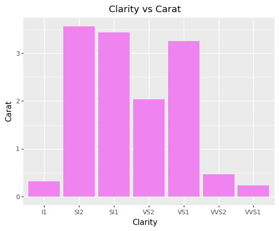
Using the fill argument in the geom_bar() or geom_col() method, we can fill the bars with colors.
ggplot(diamonds) + aes(x='clarity', y='carat')+ labs(
        x="Clarity",
        y="Carat",
        title="Clarity vs Carat",
    ) + geom_bar(stat='identity', fill='violet')
Output:
Using color and fill arguments in the geom_bar() or geom_col() method, we can fill different colors for the bar and its border in the barplot.
ggplot(diamonds) + aes(x='clarity', y='carat')+ labs(
        x="Clarity",
        y="Carat",
        title="Clarity vs Carat",
    ) + geom_bar(stat='identity', color='violet', fill='white')
Output:

We can also use the ggplot2 inbuilt themes to change the full visuals of the plots.
All the inbuilt themes are listed below:
- theme_gray()
- theme_bw()
- theme_linedraw()
- theme_light()
- theme_dark()
- theme_minimal()
- theme_classic()
- theme_void()
- theme_test()
ggplot(diamonds) + aes(x='clarity', y='carat')+ labs(
        x="Clarity",
        y="Carat",
        title="Clarity vs Carat",
    ) + geom_bar(stat='identity') + theme_light()
Output:

We can also change the colors of the bars using a variable from the dataset and add a ledger to the plot. Here we use a categorical variable in the fill argument and legend_position argument in the theme() method. legend_position can take the top, bottom, right, and left values.
We recommend you to read this article to learn more about changing the legend position in ggplot2 in Python: change legend position ggplot2 python.
ggplot(diamonds) + aes(x='clarity', y='carat', fill='clarity')+ labs(
        x="Clarity",
        y="Carat",
        title="Clarity vs Carat",
    ) + geom_bar(stat='identity') + theme(legend_position = "right")
Output:

We can also place text labels on each bar using the geom_text() method. In the example below, we are using stat_count() as we only take the x value for the plot. label in aesthetics in geom_text() is used to specify which variable should be used for labels, and va (vertical-align) is used to align the text at each bar vertically. It can take values of center, top, bottom, baseline, and center_baseline().
ggplot(diamonds) + aes(x='clarity', fill='clarity')+ labs(
        x="Clarity",
        y="Count",
        title="Clarity count",
    ) + geom_bar() + geom_text(aes(label='clarity'), stat='count', color='black', va='baseline') + theme_light()
Output:

Leave a Reply